The question how to make a website mobile friendly usually arrives as a design task — the site works, it looks cramped on a phone, and somebody should tidy that up. Google describes the situation differently, and the difference is not a matter of emphasis.
“Google uses the mobile version of a site’s content, crawled with the smartphone agent,
for indexing and ranking. This is called mobile-first indexing.”
Google Search Central, read 22 August 2026. That sentence changes the question. “Mobile friendly”
sounds like a design preference — something to get to after the real site is finished.
It is the version being read. Whatever your phone layout leaves out is left out of what
Google has, whatever the desktop version says.
Google is careful to say a mobile version is not required — “it’s not required to have a mobile version of your pages to have your content included in Google’s Search results” — and then immediately calls it “very strongly recommended”. Both halves are true and the second is the operative one.
The first real decision is structural rather than visual, and it determines how much work every other decision will be. Google names three configurations.
Responsive designone URL · one set of HTML
“Serves the same HTML code on the same URL regardless of the users’ device…
but can display the content differently based on the screen size.” Google recommends this
one, “because it’s the easiest design pattern to implement and maintain” — and, decisively,
because with it “the content and the metadata are the same on the mobile and desktop version”,
which makes most of the rest of this guide unnecessary.
Dynamic servingone URL · different HTML
Same address, but the server inspects the device and sends a different page.
It “relies on user-agent sniffing and the Vary: user-agent HTTP response header”.
Two versions to keep in step, forever.
Separate URLsdifferent addresses
A separate mobile site at its own addresses, with redirects. Everything that
can drift between two sites will drift, and the drift is invisible from a desktop.
The recommendation is worth taking at face value, and so is the reason underneath it. With responsive design there is one page, so there is nothing to keep in step: no second copy to update, no metadata to synchronise, no chance that the phone version quietly falls behind. Google says as much by scoping its own guidance — the mobile-first guide says so itself — “the contents of this guide only apply to dynamic serving and separate URL configurations.” Choosing the recommended option makes most of the advice on this subject stop applying to you.
If you did not build the site yourself, that choice may already have been made by your platform. Google’s note is practical: “If you use a CMS, such as Wix or Blogger, you might need to find a new mobile-friendly theme for your site if you can’t modify your existing theme” — and it suggests the search to run, which is the name of your platform plus “mobile friendly”.
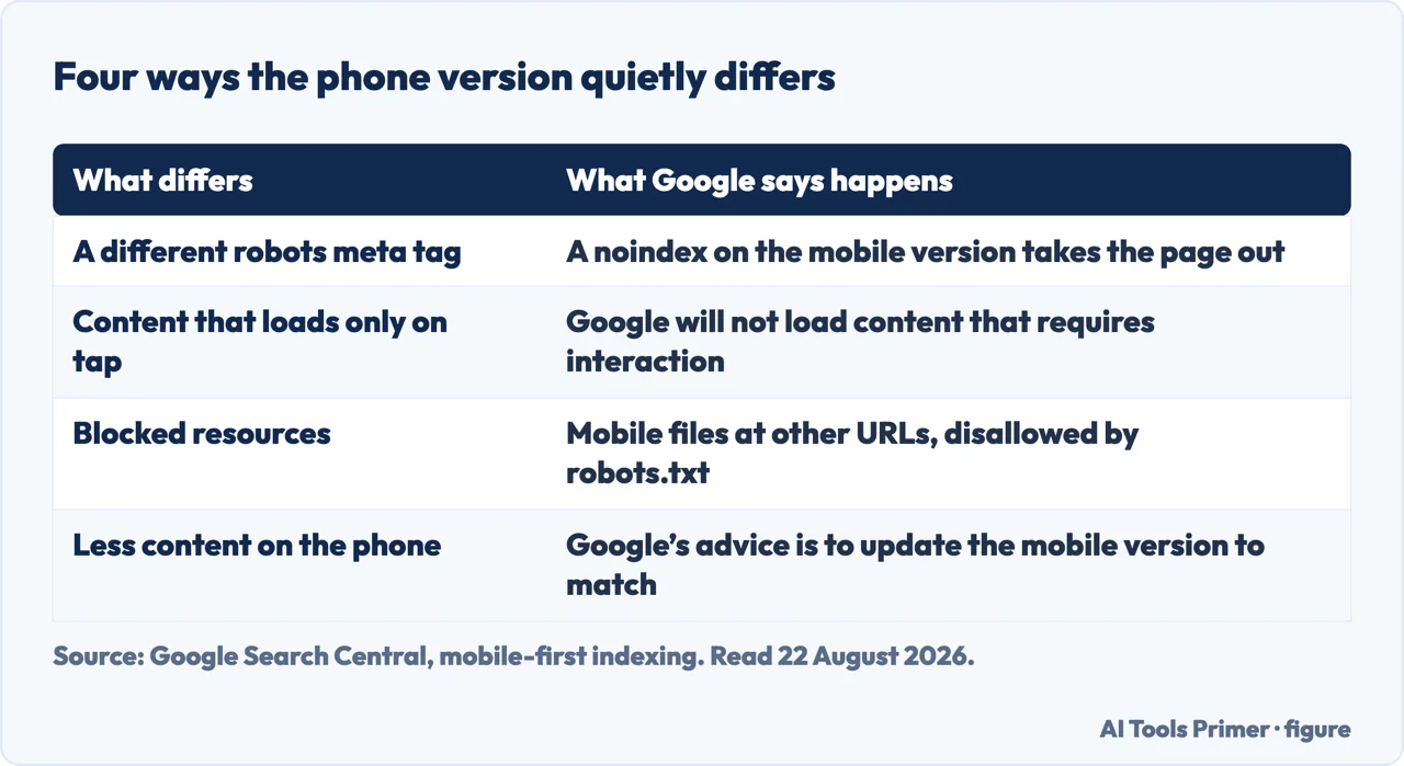
For everybody on two versions, four things break, and all four are invisible from a desktop.
What breaks, in Google’s own words
Different robots tags on the two versions
“If you use a different robots meta tag on the mobile site (especially the noindex or
nofollow tags), Google may fail to crawl and index your page.” The desktop page is fine and
the site disappears anyway.
Content that loads only when tapped
“Don’t lazy-load primary content upon user interaction. Google won’t load content that
requires user interactions (for example, swiping, clicking, or typing) to load.” Accordions and
tap-to-expand sections that hold the actual text are the common version of this.
Blocked resources
Mobile resources sometimes live at different URLs. If those are blocked by a disallow rule,
Google cannot render the page it is judging.
Less content on the phone
“If your mobile site has less content than your desktop site, consider updating your mobile
site so that its primary content is equivalent.” Google is explicit about the reason:
the same content “ensures that the two versions can rank for the same keywords”.
Source: Google Search Central, read 22 August 2026. Figure drawn by AI Tools Primer.
The second of those is the one that catches modern sites, because it looks like good design. Collapsing long text into tap-to-open sections makes a phone page feel tidy. If the text only exists after the tap, Google does not have it — and the page is then competing on whatever is left, which is usually a heading and a sentence.
The fourth is the one that catches deliberate decisions. Trimming the phone version because the screen is small is a reasonable instinct and an expensive one: Google states plainly that equivalent content is what lets the two versions “rank for the same keywords”. A shorter mobile page is not a tidier version of the same page. It is a smaller page.
One caution about layout that follows from the same paragraph: Google notes that “differences in DOM or layout between desktop and mobile page can result in Google understanding the content differently”, even when the content is equivalent. Reordering sections for a phone is normal and usually fine; burying the main subject three screens down is a different act.
The guides below take it four ways: choosing the configuration, the checks that matter, testing what Google actually sees, and the rest of building a site.
Not covered here. It will not tell you mobile is optional. Google says it is not required and very strongly recommended, and then indexes the mobile version anyway.
It will not recommend a separate mobile site. Google recommends responsive design and scopes most of its own troubleshooting guide to the other two configurations, which tells you something.
And it will not treat this as decoration. What the phone version omits is what Google does not have. What holds instead is simple: the three configurations and the four failure modes are quoted from Google Search Central’s mobile-first indexing documentation.
Step 2 of 6 in putting a site online
The order these jobs come up in for somebody who runs a website.
Google Search Central — Mobile site and mobile-first indexing best practices (that Google indexes the mobile version, the three configurations and the recommendation of responsive design, the robots-tag warning, the instruction not to lazy-load primary content on user interaction, the note on blocked resources, and the requirement for equivalent content) — developers.google.com, read 22 August 2026.
MDN Web Docs (Mozilla) — (that the viewport value gives hints about how the viewport should be sized and is defined through a comma-separated list of key-value pairs in the content attribute; that width can be a whole number of pixels, up to ten thousand, or the special value device-width, the physical size of the device screen in CSS pixels; the meaning of height, initial-scale as the ratio between device width and viewport size, maximum-scale, minimum-scale and user-scalable; and the warning that setting user-scalable to prevent zooming stops people with low vision from being able to read the page, with the note that browser settings can ignore the rule and that iOS 10 and later ignores it by default) — developer.mozilla.org, read 5 September 2026.
AG
Written by Alberto Gulotta
Founder and editor of AI Tools Primer, writing from Palermo, Italy. Thirty-five years of
taking computers apart, starting with a Commodore 64 — the long version is on the
about page.
Written on 22 August 2026 · last checked 23 September 2026.
§
Independence and limits
No affiliate links and no paid placements anywhere on this site. Nobody pays to appear here,
and no company has seen this page before you did.
This is general information, not professional advice. Where a page touches money, health,
safety or the law, it names its source and the date it was read — and your situation may
still differ. See the privacy page and the
cookie policy.