
Images · guide
How to optimize images for web, as web.dev and MDN give it
By Alberto Gulotta · Updated · 18 min read
To optimize images for web mostly means sending fewer bytes, as web.dev puts it, and this page takes the work in five steps: whether the image is needed, its size, its format, its compression and how it loads, with the pages we read giving different pixel counts and savings.
| Question | Answer | Where it comes from |
|---|---|---|
| What comes first? | Whether the image is needed at all: web.dev says that if an image can be eliminated, that is always the best optimization strategy | web.dev |
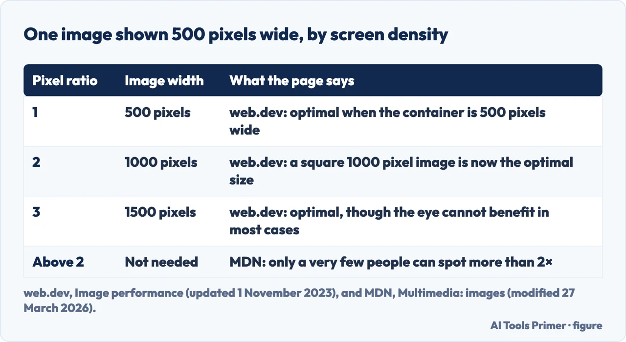
| What size? | The size it is shown at: 500 pixels wide is 500 pixels, 1000 at a pixel ratio of 2, 1500 at a ratio of 3 | web.dev |
| Which format? | JPEG and PNG work everywhere; WebP and AVIF compress better and need a fallback for older browsers | web.dev, MDN |
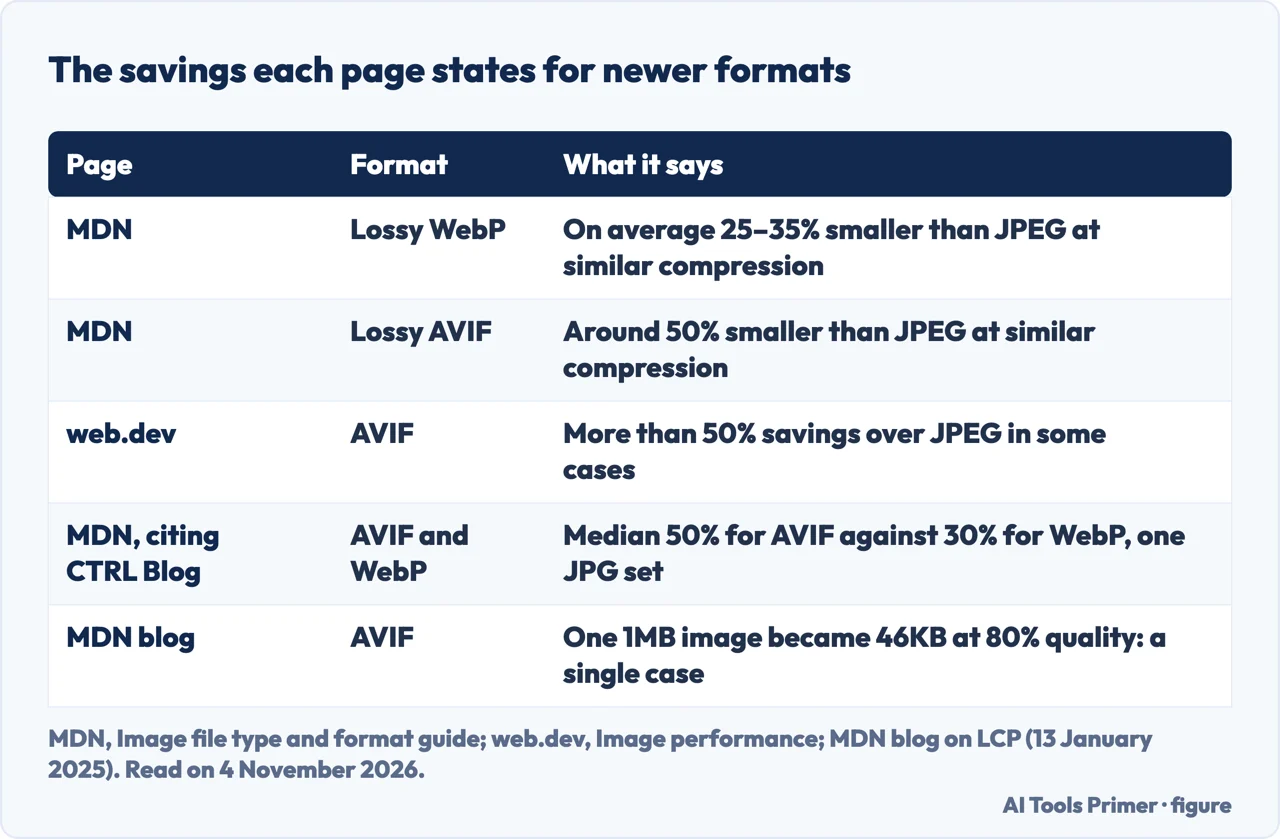
| How much smaller? | MDN gives 25–35% for lossy WebP against JPEG; web.dev says AVIF saved more than 50% in some tests | MDN, web.dev |
| Which quality setting? | web.dev says there is no universal setting; MDN suggests 75% for a progressive JPEG made with MozJPEG | web.dev, MDN |
| How should it load? | Set width and height, load images below the fold lazily, and never lazy-load the largest image on screen | MDN, web.dev |
First, ask whether the image is needed
web.dev’s guide to choosing an image format puts a question before any setting: is an image required to get the effect you are after? It says that removing an image, which often takes a large number of bytes compared with HTML, CSS and JavaScript, is always the best optimization strategy, and it allows that a well-placed image can say more than a block of text. Its next step is to ask whether another technology does the job in fewer bytes. CSS effects such as shadows and gradients stay sharp at every resolution and zoom level, and web fonts keep text selectable, searchable and resizable.
The same page tells you to stop and reconsider if you are putting text into an image, because that text is not selectable, searchable, zoomable or accessible. For logos, icons and other images made of geometric shapes it points to SVG, a vector format that stays sharp at any size. MDN gives the same reading of SVG: logos, illustrations, charts and icons, the kinds of image with few colors that are not photographic.
The reason to start there is weight. web.dev opens its image performance module by calling images often the heaviest and most prevalent resource on the web, and says that optimizing them usually means sending fewer bytes or sending images sized for the device. The pages we read give three different shares. MDN says images and video together are over 70% of the bytes downloaded for the average website, and that imagery alone is 51% of bandwidth against 25% for video. Uploadcare takes an average page of 2.64 MB with 1.02 MB of images from the HTTP Archive and calls it about 38% of page weight. The figures come from different pages and the text we read does not date them, so they are not added or blended here. MDN also adds that images, despite their share of bandwidth, affect perceived performance far less than many expect, because the page text arrives first.
How many pixels the image needs
web.dev calls size the first optimization to make: display the image at the dimensions it is shown at. An image in a 500 by 500 pixel container is optimally 500 by 500, and a square 1000 pixel image there is twice as large as needed. The complication it names is the device pixel ratio. When the iPhone 4 arrived in 2010 its screen resolution (640 by 960) was double that of the iPhone 3 (320 by 480) at roughly the same physical size, so one pixel became two device pixels. At a ratio of 2 the 1000 pixel image is the optimal one for that 500 pixel container, and at a ratio of 3 it is 1500 pixels. web.dev then adds two cautions of its own: in most cases the human eye cannot benefit from a ratio of 3, and an image smaller than the optimal size can probably be used without a perceivable decrease in quality for most users.
To let the browser choose, web.dev uses the srcset attribute. Pixel density descriptors (1x, 2x, 3x) work only when the image is shown at the same CSS size on every viewport. When the layout changes with the device, the descriptors become widths (500w, 1000w, 1500w) and a sizes attribute describes the intended display size in CSS pixels. In its example a phone 320 pixels wide with a ratio of 3 needs 960 device pixels, and the closest candidate is the 1000 pixel file. Width descriptors, the page warns, do not work without the sizes attribute.
The guides disagree on how far to go. MDN says only a very few people can spot a resolution increase beyond 2×, so images do not need to be served above that, and that on high-density screens compression artifacts are spotted later, so images for them can be compressed harder than usual. Adobe’s guide, from a company that sells image software, calls 72 pixels per inch the commonly held standard for web images, says photos and graphics around 1000 pixels wide sit well on different devices, and puts logos and icons between 100 and 600 pixels wide. It also says 200KB to 500KB is generally held to be the largest range for web images, with 2400 by 1600 pixels as the size of one meant to fill the screen. Uploadcare, whose page also promotes its own image service, gives a 600 pixel display and a 3000 pixel upload as the example to avoid. The pages we read do not say whether a PPI figure changes anything in a browser: web.dev and MDN work in CSS pixels and pixel ratio, and only Adobe gives a PPI.
More sizes mean more files to serve. web.dev answers the question of how many variants with “it depends”: each extra variant needs another cache entry, can raise server costs, and adds to the HTML, possibly several kilobytes per image. Its advice is a reasonable number of candidates and a measurement of the effect, noting that a full-width hero image may need more variants than the thumbnails on a product listing.
JPEG, PNG, WebP or AVIF
web.dev’s format page names two universally supported raster formats, PNG and JPEG, and says the newer WebP and AVIF offer better overall compression and more features. In its image performance module, WebP is a widely supported format that works on all modern browsers, with lossy and lossless compression and transparency even in lossy mode. AVIF is newer: web.dev says it is not as widely supported as WebP but has reasonably decent support, handles lossy and lossless compression, and adds wide color gamut and high dynamic range.
The savings differ by page, because they come from different tests. MDN says lossy WebP images are on average 25–35% smaller than JPEG images of visually similar compression, and lossless WebP typically 26% smaller than PNG. For AVIF it says lossy files are around 50% smaller than JPEG, and quotes a median of 50% against 30% for WebP on one set of JPG files, from a comparison on CTRL Blog. web.dev says tests have shown more than 50% savings against JPEG in some cases. The figure from the MDN blog is a single image: a 1MB file converted in Squoosh to AVIF at 80% quality came to 46KB, a 95% saving. The post is sponsored by DebugBear, a performance-monitoring company, and presents it as one case from a request waterfall, not an average.
Browser support is where the pages are furthest apart in date. MDN’s multimedia page says WebP is supported by all major browsers except Safari 14 on macOS desktop Big Sur or earlier, and its format guide says WebP has broad support in the latest versions without deep historical support. For AVIF that guide lists Chrome, Edge, Opera, Safari and Firefox and says to provide a fallback with the picture element. web.dev’s AVIF page, last updated in February 2023, dates AVIF to Chrome and Opera in 2020, Firefox in 2021 and Safari in 2022, and says JPEG XL was not supported in any browser. MDN’s current guide lists JPEG XL as supported in Chrome, Edge, Firefox and Safari, and says Safari does not support progressive download of it. We did not read a browser-support table, and web.dev’s format table sends readers to Can I use? for WebP and AVIF.
Two smaller points. AVIF does not render progressively, so the file must download in full before it shows, which MDN says often matters little because the files are much smaller, although for larger files the impact can become significant and it suggests a format with progressive rendering; WebP does not render progressively either, and MDN suggests well-compressed progressive JPEGs as the safe choice for photos.
Which format for which image
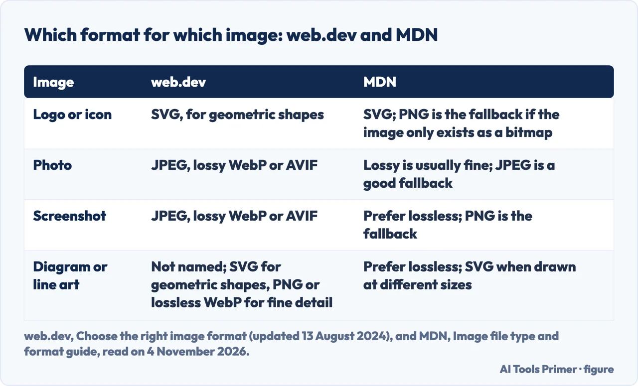
web.dev sorts the choice by what the image is. For a photo, a screenshot or a similar image it says to use JPEG, lossy WebP or AVIF, and to be aware that lossy WebP and AVIF discard information, so some colors may differ from an equivalent JPEG. To keep fine detail at the highest resolution it names PNG or lossless WebP, and says PNG will produce the highest quality image at a significantly higher file size. For animation it says to use video: GIF limits the palette to 256 colors and makes much larger files than video.
MDN sorts it differently for screenshots. Its format guide says to prefer lossless encoding for screenshots, diagrams, logos and line art, because blurring and colored fringes around text and sharp edges are very visible, and that photographs tolerate lossy compression because the discarded detail is harder to see. It calls JPEG a good fallback for photographs and PNG the better one for screenshots, diagrams and line art. Where web.dev lists screenshots with photos, MDN lists them with diagrams. On PNG, MDN’s multimedia page prefers 8-bit color with 8-bit transparency and says to avoid the 24-bit color with 8-bit transparency combination in favor of WebP.
The picture element is how both serve a newer format safely. In web.dev’s example, source elements for AVIF and then WebP come before a JPEG image element, and the browser takes the first source it can display. The nested image element carries the alt, width and height attributes whichever source is picked. The alternative web.dev gives is choosing the format on the server from the Accept request header, with a Vary response header so shared caches such as CDNs keep the variants apart. MDN names image CDN services that pick the format on the fly: Cloudinary, Image Engine, ImageKit and imgix.
Compression, and what to try it with
web.dev describes two kinds. Lossy compression reduces accuracy through quantization and may discard color information through chroma subsampling. It works best on dense photographs full of noise and color, because the artifacts show less there, and less well on sharp edges, line art and text. Lossless compression shrinks the file with no data loss and covers GIF, PNG, WebP and AVIF. web.dev’s warning is the practical one: with lossy compression, always confirm that the result meets your quality standards, since high-contrast colored text on a flat color is prone to artifacts. Adobe offers a rule of thumb on the same split: lossless for a photography portfolio, lossy for general site use, especially pages with many photos.
On settings the pages differ again. web.dev says there is no universal setting suitable for all cases and recommends trying compression levels until the quality and file size compromise is a good one. MDN, in the context of a progressive JPEG made with MozJPEG in Squoosh, says a quality setting of 75% should give decent results. The two statements can both hold: one is a method, the other a starting point for one format.
The tools named are free web apps and desktop programs. web.dev names Squoosh, ImageOptim and image optimization services. MDN names SVGOMG for SVG files and either ImageOptim online or Squoosh for PNG, and says Squoosh also converts to AVIF. Uploadcare lists Squoosh and ImageOptim, the latter as a macOS app that compresses in bulk. Adobe’s route is Photoshop’s Save for Web with an Optimise to File Size option. Two more tips concern search and accessibility rather than bytes. Adobe advises alt text that is helpful, succinct and clear, at 125 characters at most, and that describes the information, not the picture (its example of weak alt text is “a picture of a classroom”). Uploadcare advises file names made of real words, such as blue-running-shoes.jpg instead of IMG_1234.jpg. Both are companies whose pages promote their own products, and the web.dev and MDN pages we read do not cover those two points.
How the page loads the image
MDN says that setting width and height attributes lets the browser compute the aspect ratio before the image loads and reserve its space, which reduces or prevents layout shift. Without them, a stylesheet that sets max-width to 100% and height to auto leaves the height at 0 until the image arrives, and the page jumps. MDN calls including both attributes a developer best practice.
Lazy loading is the other change MDN names as one of the biggest: loading images beneath the fold only when needed, with the loading attribute set to lazy. web.dev describes the attribute as telling the browser not to download an image until it is in or near the viewport. The exception comes from web.dev’s page on the largest contentful paint (LCP): “Never lazy-load your LCP image,” because that adds load delay and hurts LCP. Uploadcare presents lazy loading as a general technique, warns it can hurt the experience if badly implemented, and does not make the exception. The MDN blog gives the other side of the case: with ten images and only the first visible, lazy loading the other nine can free bandwidth for the first.
For the image that is the LCP, web.dev says it is a good idea to set fetchpriority to high on an image you think will be it, and that setting a high priority on more than one or two images makes the setting unhelpful. MDN says an image element gets higher priority than a CSS background image. The MDN blog adds that images inserted with JavaScript are discovered late, since the script has to run first, and that when the LCP image is a CSS background, a preload with fetchpriority high helps the browser find it earlier.
web.dev defines a good LCP as 2.5 seconds or less for at least 75% of page visits, and splits it into four parts: time to first byte, resource load delay, resource load duration and element render delay. For a well-optimized page it gives roughly 40% for the first, under 10% for the second, roughly 40% for the third and under 10% for the last, as guidelines and not strict rules. It also shows why smaller files are not enough by themselves: on its example page, compressing an image more shortened the load duration but did not improve LCP, because the element stayed hidden until JavaScript finished loading and the saved time moved to render delay. web.dev also lists a decoding attribute, whose effect it says may be noticeable only on very large images.
What the pages leave open, and what we did not read
The pages we read do not give a number of variants to keep: web.dev’s answer is “it depends.” They do not give one quality setting to use for every image. They do not say which of WebP or AVIF suits a given site, and MDN and web.dev both keep a fallback in their examples. Only Adobe gives a PPI figure, and the pages we read do not say whether it matters to a browser.
We converted no image and measured no page. We did not read DebugBear’s own article on image optimization, which loaded blank. We did not read a browser-support table such as Can I use?, so this page gives no version numbers. For resizing and converting files on your own computer, our pages on reducing image file size, WebP files, PNG and JPG and resizing an image cover the steps.
Where to start
Five ways in.
- “Do I need this image?”
- First, ask whether the image is needed — need
- “How big should it be?”
- How many pixels the image needs — size
- “JPEG, PNG, WebP or AVIF?”
- JPEG, PNG, WebP or AVIF — format
- “What quality setting?”
- Compression, and what to try it with — compress
- “How should it load?”
- How the page loads the image — loading
Smaller files and formats
Compression, WebP and the JPG and PNG choice.
Changing the pixel size
Resizing in three programs.
Questions people also ask
Can you use 300 dpi for web?
The pages we read do not mention 300 dpi. Adobe calls 72 pixels per inch the commonly held standard for web images and says a higher figure is possible on an HD screen; web.dev and MDN size images in CSS pixels and pixel ratio, not in PPI.
Is JPEG or PNG better for web?
web.dev points to JPEG, lossy WebP or AVIF for photos and screenshots, and says PNG gives the highest quality at a significantly higher file size. MDN calls JPEG a good fallback for photographs and PNG better for screenshots, diagrams and line art.
How can you enhance an image for web use?
The pages we read describe shrinking rather than enhancing: show the image at the size it is displayed, pick a format, compress it and check that the result meets your quality standards, as web.dev says. Adobe adds descriptive alt text of 125 characters at most, and Uploadcare adds file names made of real words.
How to get images to load faster on your website?
Send fewer bytes with the right size and a modern format. MDN says to set width and height and to lazy-load images below the fold; web.dev says never to lazy-load the LCP image and to give high fetchpriority to one or two images at most.
Not covered here. We converted no image and measured no page. The statements come from four web.dev pages, two MDN pages and an MDN blog post, and the guides of Adobe and Uploadcare, all read on 4 November 2026.
The search volume and difficulty behind this page come from an Ubersuggest reading of 4 November 2026 (United States), which gives search volume and its own SEO difficulty score, not Semrush’s.
Sources
- web.dev — Image performance — web.dev, read 4 November 2026.
- web.dev — Choose the right image format — web.dev, read 4 November 2026.
- web.dev — Optimize Largest Contentful Paint — web.dev, read 4 November 2026.
- web.dev — AVIF — web.dev, read 4 November 2026.
- MDN — Multimedia: images — developer.mozilla.org, read 4 November 2026.
- MDN — Image file type and format guide — developer.mozilla.org, read 4 November 2026.
- MDN blog — Fix your website’s Largest Contentful Paint by optimizing image loading — developer.mozilla.org, read 4 November 2026.
- Adobe — Optimising Images for the Web: Best Practice Guide — www.adobe.com, read 4 November 2026.
- Uploadcare — How to optimize images for the Web: best practice guide — uploadcare.com, read 4 November 2026.
Written by Alberto Gulotta
Founder and editor of AI Tools Primer, writing from Palermo, Italy. Thirty-five years of taking computers apart, starting with a Commodore 64 — the long version is on the about page.
Something wrong on this page? Write to aitoolsprimer@gmail.com and it gets fixed.
Written on 4 November 2026.
Independence and limits
No affiliate links and no paid placements anywhere on this site. Nobody pays to appear here, and no company has seen this page before you did.
This is general information, not professional advice. Where a page touches money, health, safety or the law, it names its source and the date it was read — and your situation may still differ. See the privacy page and the cookie policy.