
Work · guide
How to structure a resume: where six guides agree and differ
By Alberto Gulotta · Updated · 16 min read
To structure a resume, the guides we read build on a few shared rules: name and contact details first, the strongest section near the top and entries newest first. They differ on where Education sits, whether to open with a summary, and how many pages to use.
| Question | Answer | Where it comes from |
|---|---|---|
| What goes first? | Name and contact details; then what matters most to the employer | Georgetown, Texas State |
| How are entries ordered? | Most recent first, inside each section | Georgetown, Harvard, Texas State |
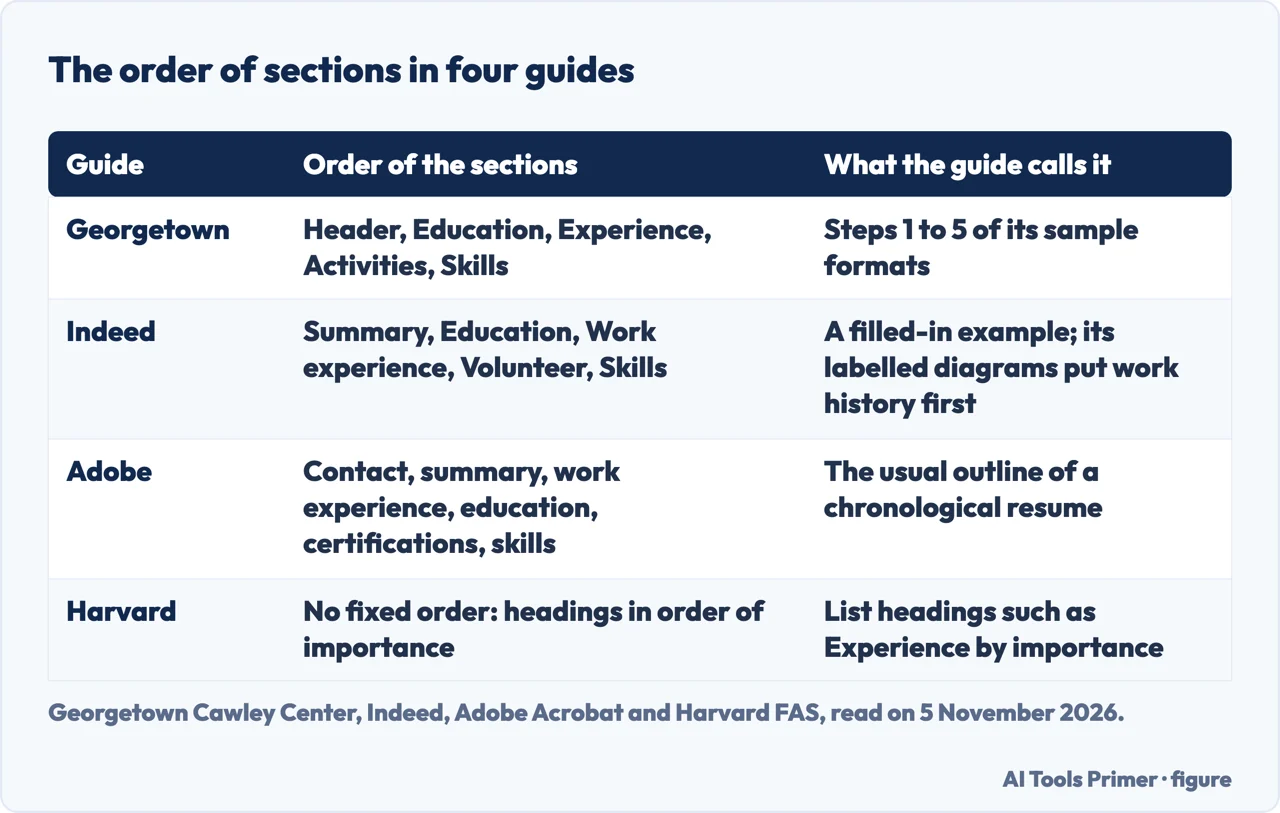
| Does Education come before Experience? | Georgetown and Indeed’s filled-in chronological example put Education first; Adobe’s outline, and Indeed’s own labelled section diagrams, put Experience first | Georgetown, Indeed, Adobe |
| Is a summary needed? | Texas State lists it among the minimum sections; Adobe calls it optional | Texas State, Adobe |
| One page or two? | Georgetown says one; CareerOneStop says 1 to 2 | Georgetown, CareerOneStop |
| What does CareerOneStop advise for applicant tracking systems? | A simple single-column layout with standard headings | CareerOneStop |
Three formats, and what each puts first
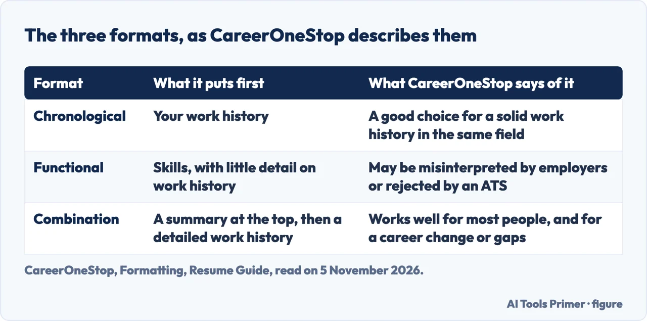
Indeed, a job site, says a resume format is how your information is organized on the page, and that it sets the order in which an employer goes through your work history, skills and education. CareerOneStop, Indeed and Adobe name the same three formats: chronological, functional and combination.
CareerOneStop, a service that says it is sponsored by the U.S. Department of Labor, gives each format a sentence. A chronological format emphasizes work history and is a good choice for people with a solid work history who are staying in the same field. A functional format emphasizes skills and experience, with little detail on work history; the page warns that without a detailed work history the resume may be misinterpreted by employers or rejected by applicant tracking systems. A combination format has a summary at the top, may also have a skills section, and still includes a detailed work history. CareerOneStop names transferable skills, a career change and work gaps as the cases the combination format suits.
Adobe, a software vendor, gives the outlines. Its chronological outline runs from contact information to an optional professional summary of two to three sentences, then work experience, education, certifications and licenses, skills and optional sections. Its functional outline keeps the summary, groups skills into categories, and makes work experience optional or minimal: job title, company name and location, and dates that may be optional or years only. Its combination outline runs from contact information and summary to key skills in categories, then work experience, education, certifications and optional sections. Adobe describes the combination as useful for career changers, professionals with diverse experience, or people with employment gaps. Indeed’s functional example has the same shape: a summary, areas of expertise, a work history reduced to titles and years, then education and certifications.
Adobe says recruiters can scan the chronological format easily to judge career growth and experience, and Indeed says it shows work history and progression clearly. Indeed adds that its example resumes are for illustration only, so they show an arrangement and not a rule.
The core the guides repeat
Georgetown’s sample format opens with a header: the name in bold and larger than the rest of the resume, and below it a current mailing address, a phone number and the email address you use most. Georgetown says you may use a permanent mailing address instead. Texas State puts the same items first, and says name and contact information should always be first. Its heading takes the name, an address that is optional, a phone number with area code and an email address, and it notes that you may not want a physical address for privacy. It sets the name at 14 to 18 points.
After the header, Texas State says to put what matters most to the employer you are targeting at the top, and the least important information toward the bottom. It adds that extra categories can be created for other strengths, and lists Leadership Activities, Relevant Skills and Experience, Interests and Accomplishments as examples. Harvard gives the same rule in one line: list headings such as Experience in order of importance. Texas State’s final checklist asks whether the best assets are listed first, whether they are education, experience or skills. In those two guides the structure rule is a ranking, not a fixed order of sections.
Inside a section, three guides agree on direction. Harvard says to list information in reverse chronological order within headings, most recent first. Georgetown asks for experiences in reverse chronological order. Texas State’s checklist says listings in different sections run from most recent to least recent, and that the dates of employment should be easy to find and in a consistent format. Harvard adds two cautions about dates: avoid information gaps such as a missing summer, and do not start each line with a date.
Some of what the guides tell you to leave off is about structure too. Georgetown says not to include a birth date, marital status or photograph. Harvard lists a picture, age and gender among its things not to include. Harvard says guidelines can vary from country to country, and Georgetown says to find out the resume expectations of the country if you apply outside the U.S.
Where Education goes: the guides differ
The examples disagree most plainly here. Georgetown’s format runs header, Education, Experience, Activities, Skills. Its Education step says to list your most recent education first, with university, school, major, minors and graduation month and year, and to include your GPA. The page is from a university career center and its steps are written for students. Indeed’s chronological example, a communications specialist with six years of experience, runs summary, education, work experience, volunteer experience and skills. Its combination example opens with education, then professional experience, core skills and additional skills, with no summary. Adobe’s chronological outline puts work experience before education. Indeed contradicts its own example: the two labelled diagrams on the same page list the chronological sections as name and contact information, summary or objective, professional history, education history, skills, and the generic format diagram runs professional history (most recent first) before education. So one source, read in full, gives both orders.
Harvard and Texas State give a criterion in place of an order. Harvard says to list headings in order of importance. Texas State says the best assets go first. Its Education section can include training, certifications or licensure, lists degrees with the degree title before the institution name, and can add a GPA, relevant coursework, honors and study abroad. Its Experience section covers paid or unpaid work-related accomplishments, such as full-time jobs, research projects, internships, part-time jobs and volunteer work. The pages we read do not give a number of years of experience after which Education moves below Experience. In Indeed’s example six years of work still sit below education; in Adobe’s outline education comes after work experience.
Indeed ties the choice to the stage of a career. For entry-level job seekers it describes resumes that focus on skills, education, internships or volunteer experience, with functional or combination formats to show abilities when work history is limited. For mid-career professionals it says chronological or combination formats are often used, because they can show progression. For career changers it points to functional or combination formats that emphasize transferable skills. Indeed also says preferences vary by employer and role, and suggests reading the job description for clues; tailoring a resume to a posting, it says, may include rearranging sections or emphasizing different skills.
The summary at the top is a second point of disagreement. Texas State names an Objective or Summary of Qualifications among the sections a resume should include at least. Adobe calls the professional summary optional. CareerOneStop puts a summary at the top of the combination format. Georgetown’s five steps do not include one, and Indeed’s combination example starts without one while its chronological and functional examples have one.
Inside the sections: experience, skills and activities
Georgetown describes the Experience section as the place for the experiences most relevant to the position. Often those are jobs and internships, but it says they can also be coursework or extracurricular activities. It suggests that you might divide them into two categories if that makes a stronger case, for example “Relevant Experience” and “Additional Experience,” or a more specific name such as “International Relations Experience.” Georgetown says this can direct an employer’s attention to the experiences you most want noticed, and that each section keeps its own reverse chronological order.
For each entry Georgetown asks for a header with the name of the organization, the location, the dates and the position title, then three or four sentences on the work. If you held more than one role at an organization, it says to include each title. Texas State asks for the position, organization, city, state and dates, begins each statement with an action verb, and says to quantify people, products and profits if possible. Harvard’s list of language rules asks for wording that is specific, active and fact-based. Our page on accomplishments on a resume goes further into rewriting duties as results.
Georgetown’s fourth step is Activities: extracurricular activities such as sports, on-campus involvement or volunteer experience, each with a brief description. Its fifth step is Skills, and it names languages with a level (basic, intermediate, advanced or fluent), specific software, relevant training or certifications, and social media and web technologies where they apply. The two can share one heading, “Skills & Activities,” if you need to save space. Indeed’s chronological example puts volunteer experience before skills, while Adobe lists volunteer experience among optional sections.
Texas State places skills either in the Summary of Qualifications or in a dedicated Skills section, and says they should be supported by the Education and Work Experience sections. It names three kinds: technical, laboratory or professional skills; functional skills that transfer between fields; and personal or adaptive skills. Our page on which skills to list takes up the skills section on its own.
Structure for the software that reads it first
Georgetown says applicant tracking systems scan resumes for keywords and relevant experiences, and that only candidates who meet the initial criteria are referred to the hiring manager. That is about wording, not structure, and our page on an ATS-friendly resume template covers it; here the point is only that a structure rule such as a single column is meant to let those scans read the page in the right order.
CareerOneStop is the guide that ties layout to these systems. It says ATS software scans resumes left to right, so a resume should start with a simple single-column layout. It asks for standard section headings such as “Work Experience,” “Education” and “Skills” so both human readers and ATS can find information. It says to avoid tables, text boxes, logos, columns, images and graphics, because an ATS may scramble the content, and to keep important information out of the header and footer, since some systems cannot read text placed there. Lines and borders are acceptable as long as they do not touch any text.
The same page makes the dates part of the structure. It asks for the standard format MM/DD/YYYY or Month, YYYY, without abbreviations such as ’19, and for the exact dates you began and ended each job. The reason it gives is that an ATS may assign a default time, such as 6 months, when none is specified. It also says that extra keywords in a white font will not trick an ATS. Harvard’s quick tips ask for language written for people who, or systems that, scan quickly, and for formatting that translates properly if the file is converted to a PDF.
Our page on an ATS-friendly resume template looks at how a parser reads a document and what defeats it.
Pages, margins, fonts and references
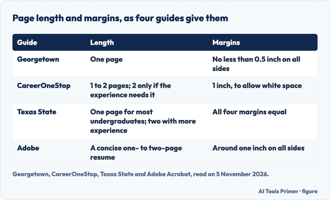
Georgetown says to keep the resume to one page. CareerOneStop says 1 to 2 pages, and to use two only if the amount of experience requires it; the sample it shows, a combination resume for a person named Maya, runs two pages, which CareerOneStop says leaves room for a strong opening and plenty of white space. Texas State says most undergraduates should keep to one page and that two pages are an option for job seekers with more experience, and it warns that a resume that is too lengthy or unorganized may be disregarded. Adobe speaks of a concise, one- to two-page resume. Our page on how long a resume should be goes further into the question.
Margins differ by guide. Georgetown sets them at no less than 0.5 inch on all sides, CareerOneStop uses 1 inch to allow white space, Adobe says around one inch, and Texas State asks for all four to be equal. On type the guides are closer: Georgetown, Texas State, CareerOneStop and Adobe all give 10 to 12 points. CareerOneStop asks for one font throughout, or a second used only for headings, and lists Calibri, Arial, Georgia, Garamond and Times New Roman if none is specified. Adobe lists Arial, Calibri, Times New Roman and Helvetica.
References are where the guides separate. Harvard puts “list references” among the things not to do. Texas State says references should always be presented on a separate page, not included with the resume, with each reference’s name, title, organization, work address, telephone number and email address, and with each person aware of being listed.
On saving the file, CareerOneStop says to send a PDF unless another format is specified, with a file name that includes your full name or your full name plus job title, such as Sarah-Smith-Marketing-Coordinator. Georgetown also says to save as a PDF with an appropriate name. Our page on what to put on a resume covers what goes inside the sections these pages leave open.
Where to start
Five ways in.
- “Which format do I use?”
- Three formats, and what each puts first — formats
- “Does Education go first?”
- Where Education goes: the guides differ — education
- “What goes inside each section?”
- Inside the sections: experience, skills and activities — entries
- “Will software read it?”
- Structure for the software that reads it first — machines
- “One page or two?”
- Pages, margins, fonts and references — pages
Layout, length and years
How software reads a resume, how long it runs and how far back it reaches.
Filling the sections
What goes into the sections, how the entries are written and which skills to list.
Questions people also ask
What are the 5 P's of a resume?
The pages we read do not mention a list of five P's. What they give on structure is name and contact details first, headings in order of importance, and entries newest first inside each section.
What is the 7 second rule in resume?
The pages we read do not mention a seven-second rule. Adobe says many employers spend less than a minute with each resume on a first pass, and Harvard asks for language written for people or systems that scan quickly.
What is a red flag on a resume?
The pages we read do not use the phrase. Harvard’s top five mistakes include a resume that is not well organized, concise or easy to skim, and it advises avoiding gaps such as a missing summer.
What are the 3 C's of a good resume?
The pages we read do not mention three C's. They do describe three formats, chronological, functional and combination, which CareerOneStop, Indeed and Adobe all name.
Not covered here. We built no resume and ran none through an applicant tracking system. The statements come from six pages, read on 5 November 2026: Georgetown, Harvard, CareerOneStop, Texas State, Indeed and Adobe. Indeed and Adobe are sold by companies, so we used them for what they state and not as recommendations.
Harvard’s sample and template files are PDFs and images that we did not open. A Reddit thread on the subject was not read and was not used as a source. The search measure behind this page is an Ubersuggest reading of 5 November 2026; a Semrush reading is still to be made.
Sources
- Georgetown Cawley Career Education Center — Resume Content & Formatting — careercenter.georgetown.edu, read 5 November 2026.
- Harvard FAS Mignone Center for Career Success — Harvard College Guide to Creating a Strong Resume — careerservices.fas.harvard.edu, read 5 November 2026.
- CareerOneStop — Formatting, Resume Guide — www.careeronestop.org, read 5 November 2026.
- Texas State Career Services — How to Create a Job-Winning Resume — www.careerservices.txst.edu, read 5 November 2026.
- Indeed — Resume Format Guide (With Examples) — www.indeed.com, read 5 November 2026.
- Adobe Acrobat — Resume formatting: how should a resume look — www.adobe.com, read 5 November 2026.
Written by Alberto Gulotta
Founder and editor of AI Tools Primer, writing from Palermo, Italy. Thirty-five years of taking computers apart, starting with a Commodore 64 — the long version is on the about page.
Something wrong on this page? Write to aitoolsprimer@gmail.com and it gets fixed.
Written on 6 November 2026.
Independence and limits
No affiliate links and no paid placements anywhere on this site. Nobody pays to appear here, and no company has seen this page before you did.
This is general information, not professional advice. Where a page touches money, health, safety or the law, it names its source and the date it was read — and your situation may still differ. See the privacy page and the cookie policy.