Apple provides a control for this, and it is not a switch. Knowing that first saves hunting through Settings for something that is not there.
“Tap Appearance, then tap Liquid Glass. Drag the slider to the right to
increase the tint of Liquid Glass, and to the left to make Liquid Glass more clear.”
That is Apple’s own control on iOS 27, and it is the first thing to know: there is no
off. What the menu offers is a dial between clear and tinted, not a switch, and the direction
people are looking for is towards the tint — more tint is more contrast and more opacity.
On iOS 26 the same control sat under Display & Brightness and offered two named
looks instead of a slider: “Choose Clear for a more transparent look or Tinted for
more contrast and increased opacity.” Either way it is a dial rather than a door — and the dial
may be enough, which is worth trying before going further.
Apple describes what it is changing in the same documentation: Liquid Glass “brings a more expressive and seamless experience to your Lock Screen and Home Screen, as well as apps, navigation, and controls”. That breadth is worth holding on to: what is being adjusted is the appearance of the interface itself, not a feature sitting on top of it. Apple does not say why there is no single switch, and this page will not supply a reason it did not give.
What exists instead is three separate settings, in two different places, each doing something different.
Liquid Glass: more tint
the mildest · Appearance
Apple’s own dial. On iOS 27 you “drag the slider to the right to increase the tint of Liquid
Glass”; on iOS 26 the same menu named the two ends, and Tinted gave “more contrast
and increased opacity”.
Changes the appearance without leaving the design.
Reduce Transparency
stronger · Accessibility
“Some backgrounds appear transparent or blurred by default. You can make these transparent
backgrounds opaque by giving them a solid color.”
Settings → Accessibility → Display & Text Size.
Reduce Motion
a different complaint
Apple, on iOS 26: the “Reduce Motion setting more reliably reduces the animations of
Liquid Glass for users sensitive to on screen motion”.
Nothing to do with transparency.
The third one is the one worth pausing on, because it answers a complaint that the other two cannot. Transparency and motion are not the same objection. A screen that is hard to read through is a transparency problem; a screen that shifts and refracts as you move is a motion one. Apple treats them as separate settings in separate menus, and reaching for the wrong one produces a change you did not want and leaves the one you did.
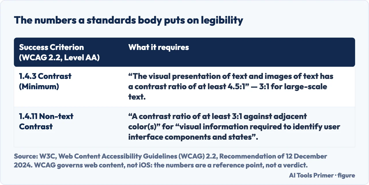
There is a number attached to this complaint, published by somebody who does not sell the interface. The W3C’s Web Content Accessibility Guidelines set a published minimum for legibility: text “has a contrast ratio of at least 4.5:1”, with “at least 3:1” for large-scale text, and “visual information required to identify user interface components and states” needs “a contrast ratio of at least 3:1 against adjacent color(s)”. Two things have to be said straight away. WCAG governs web content, not an operating system, so nothing here is a finding about iOS and nothing here says Apple fails it. And a translucent surface does not have one contrast ratio: what is behind it changes from screen to screen, which is the whole difficulty. What the numbers are good for is the argument — “I cannot read this” is a claim about a measurable threshold rather than a matter of taste, and Tinted exists precisely to raise it.
A standards body’s numbers for web content, quoted as a reference point rather than a verdict. Figure drawn by AI Tools Primer.
Which of the two complaints is yours
They are different settings in different places, and the wrong one will not help.
“I cannot read things through it.”
That is transparency. Try more tint first, and if that is not enough, Reduce
Transparency in Accessibility — which is stronger and costs you the Liquid Glass
choice.
“It moves too much.”
That is motion, and no transparency setting will touch it. Reduce Motion is
the one, and Apple says iOS 26 made it work on Liquid Glass specifically.
“Both.”
They stack — but check the dependency above before assuming a setting has failed.
A control that appears to ignore you may be one the other setting has disabled.
And then there is the dependency between them, which Apple states outright and which explains why the control can look broken.
“If you turned on Reduced Transparency or Increased Contrast in Accessibility
settings, you need to turn them off to change the look for Liquid Glass.”
This is the sentence that turns a simple answer into a confusing one, and it runs backwards
from what you would guess. The accessibility setting that reduces transparency takes away
the Liquid Glass choice. So somebody who turned on Reduce Transparency first, and then went
looking for the Liquid Glass menu, will find it will not respond — and the fix is to switch off
the very thing they turned on. Apple states it as a plain dependency; it is worth reading twice
because the order in which you touched the two settings decides what you are now looking at.
Where the two menus are, since they are not together. The Liquid Glass
choice lives in Settings → Appearance on iOS 27 — it was Display & Brightness
on iOS 26 — alongside Text Size, Bold Text and Display Zoom. Reduce Transparency and Reduce Motion live in Settings →
Accessibility → Display & Text Size — a different app section with a similar name.
Apple’s display page ends by pointing there itself: if you want to “bump up the contrast, or make
additional adjustments so it’s easier to read your screen”, that is where it sends you.
One consequence of that layout is worth stating plainly, because it is easy to conclude the setting does not exist. The Liquid Glass control is not in Accessibility. It sits with the ordinary display options, one level up. Somebody who reasons that a visual-comfort setting belongs under Accessibility will find other useful settings there — including the stronger one — but not the specific menu Apple named.
It is worth being fair to the design while answering the question. Apple’s stated intention for Liquid Glass is that it “refracts and reflects content in real time”, which is a description of something meant to be looked at rather than through. Whether that is pleasant or tiring is not something a page can decide for you, and this one will not try. What it can do is name the three levers and say which complaint each of them answers.
What this page will not tell you is how to restore an older look. Apple documents two Liquid Glass options and a set of accessibility settings; it does not document a way to return the interface to a previous version of iOS, and there is nothing published to report on that.
The guides below take it three ways: the settings themselves, the accessibility menu that holds the stronger ones, and the other things on an iPhone screen that turn out to be settings rather than faults.
Where to start
Three ways in. The first question is what exactly is bothering you.
The Liquid Glass dial, Reduce Transparency and Reduce Motion. Two of them are about seeing through the interface and one is about it moving, and they live in different menus.
Apple states that Reduced Transparency or Increased Contrast must be off before the Liquid Glass look can be changed. A control that ignores you may be one another setting has disabled.
A great deal of what looks wrong on an iPhone screen is something switched on. These guides are the other cases where the answer was a setting all along.
Not covered here. It will not point you at an off switch. Apple documents two looks and a set of accessibility settings, and none of them is a way to remove the design.
It will not tell you Reduce Transparency is the obvious answer. It is the stronger one, and Apple says it takes the Liquid Glass choice away while it is on.
And it will not explain how to go back to an older interface. Nothing published describes that, and a page that improvised one would be inventing the part that matters. What holds instead is simple: three settings stay three settings, in Apple’s own words, including the one that has to be off before the look can change at all.
Something on the iPhone screen you did not choose
Four things people take for faults, and all four are settings.
Apple, Adjust iPhone display and text settings — iPhone User Guide, iOS 27 (that the preferred look for Liquid Glass is chosen at Settings → Appearance → Liquid Glass, dragging the slider to the right to increase the tint and to the left to make it more clear; the note that if Reduced Transparency or Increased Contrast have been turned on in Accessibility settings they must be turned off before the Liquid Glass look can be changed; that Text Size, Bold Text and Display Zoom sit in the same Display & Brightness section; and that further contrast and readability adjustments are made at Settings → Accessibility → Display & Text Size) — support.apple.com, read 16 September 2026.
Apple, Adjust iPhone display and text settings — iPhone User Guide, iOS 26 version of the same article, kept because the two versions describe two different controls: there the look is chosen at Settings → Display & Brightness → Liquid Glass, Clear for a more transparent look or Tinted for more contrast and increased opacity — support.apple.com, read 16 September 2026.
Apple, Change display colors on iPhone to make it easier to see what’s onscreen — iPhone User Guide (that some backgrounds appear transparent or blurred by default and can be made opaque by giving them a solid colour, simplifying those parts of the screen, by going to Settings → Accessibility → Display & Text Size and turning on Reduce Transparency) — support.apple.com, read 6 September 2026.
Apple, About iOS 26 Updates (that the new design with Liquid Glass brings a more expressive and seamless experience to the Lock Screen and Home Screen as well as apps, navigation and controls, and that Liquid Glass refracts and reflects content in real time; and that the Reduce Motion setting more reliably reduces the animations of Liquid Glass for users sensitive to on screen motion) — support.apple.com, read 22 August 2026.
W3C — Web Content Accessibility Guidelines (WCAG) 2.2, W3C Recommendation of 12 December 2024 (Success Criterion 1.4.3 Contrast (Minimum), Level AA, that the visual presentation of text and images of text has a contrast ratio of at least 4.5:1, with large-scale text at 3:1; and Success Criterion 1.4.11 Non-text Contrast, Level AA, that visual information required to identify user interface components and states has a contrast ratio of at least 3:1 against adjacent colours). WCAG applies to web content, not to iOS — www.w3.org, read 5 September 2026.
AG
Written by Alberto Gulotta
Founder and editor of AI Tools Primer, writing from Palermo, Italy. Thirty-five years of
taking computers apart, starting with a Commodore 64 — the long version is on the
about page.
Written on 22 August 2026 · last checked 23 September 2026.
§
Independence and limits
No affiliate links and no paid placements anywhere on this site. Nobody pays to appear here,
and no company has seen this page before you did.
This is general information, not professional advice. Where a page touches money, health,
safety or the law, it names its source and the date it was read — and your situation may
still differ. See the privacy page and the
cookie policy.