Bar
Google: “Use a bar chart when you want to compare individual items. For example, compare ticket sales by location, or show a breakdown of employees by job title.” Every bar starts at zero, so the lengths mean what they look like they mean.

Docs · guide
By Alberto Gulotta · Updated · 11 min read
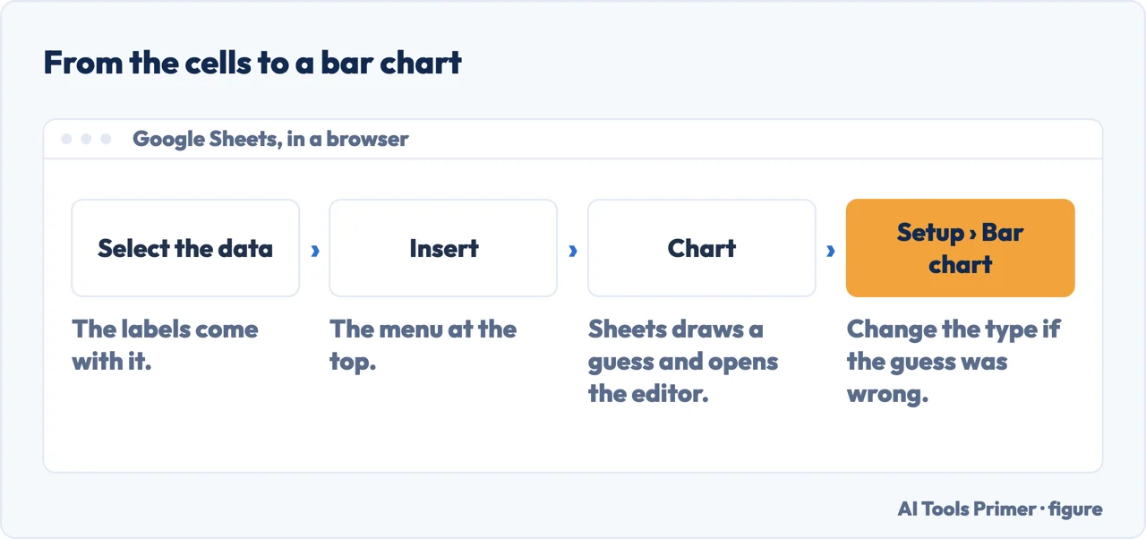
To create a bar graph in Google Sheets: select the cells, Insert › Chart, and if Sheets guesses another type, change it under Setup. The two things worth a page are what shape the data has to be in, and which of the three bar charts you actually want.
| What | What it becomes, or what it means | Source |
|---|---|---|
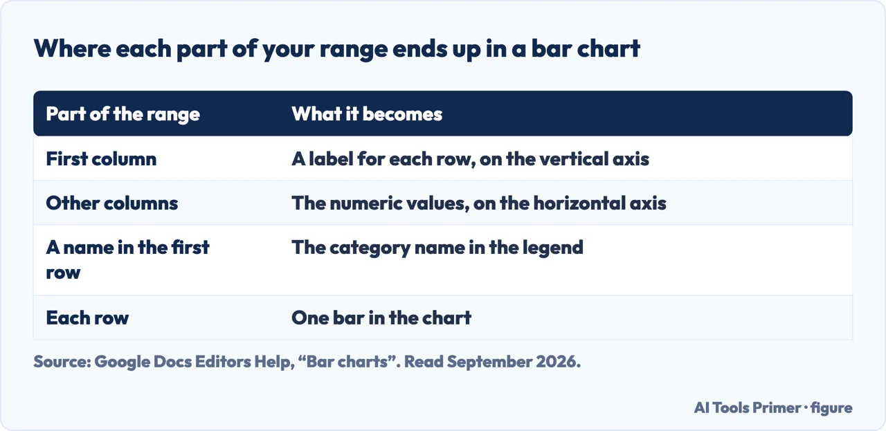
| First column | “A label for each row”, shown on the vertical axis | |
| Other columns | The numeric data; the values “show up on the horizontal axis” | |
| Each row | “Each row represents a different bar in the chart” | |
| Bar chart | The length of a bar is the value. Google: use it “when you want to compare individual items” | |
| Stacked bar | The length is the total of its parts | |
| 100% stacked bar | Every bar is the same length; only the mix changes |
Google tells you how to lay out the data, and the layout is the chart
This is the part the tutorial pages skip, and it decides everything that happens next. Quoted from Google’s own page on bar charts.
Read the third one again, because it is the whole thing. A bar is a row. If your chart has four bars and you expected twelve, your figures are running across the sheet instead of down it — and Google gives the fix in a one-line tip: “If the chart doesn’t show the data on the axis you want, learn how to switch rows and columns.” Almost every “my chart looks wrong” question in Sheets is that sentence.
Bar
Google: “Use a bar chart when you want to compare individual items. For example, compare ticket sales by location, or show a breakdown of employees by job title.” Every bar starts at zero, so the lengths mean what they look like they mean.
Stacked bar
Google: “Use a stacked bar chart to show part-to-whole relationships and find trends in data over time. For example, show how 4 office locations contributed to total sales.” The totals compare honestly; the bands inside do not, because only the first one sits on the baseline.
Google’s requirement: “at least 2 data series”100% stacked bar
Google gives the sharpest test of the three: use it “when you want to show the relationship between individual items and the whole in a single bar, and the cumulative total isn’t important”. That last clause is the decision. Every bar is the same length, so the totals are not merely hidden — they are gone.
Google’s requirement: “at least 2 data series”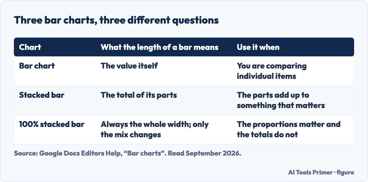
And the shape is not a matter of taste. North Carolina State University’s graphing guide separates a bar graph from a histogram by what the data is, not by how it looks: “histograms are a specialized type of bar graph used to summarize groups of data”. Sheets will draw either over the same numbers without comment.
The three of them answer different questions, and the answers are not interchangeable. Plain bars answer which is biggest. Stacked answers what is each total made of, and how are the totals moving. The 100% version answers what is the mix and deliberately throws the size away. Choosing the third when you meant the second produces a chart where a division that halved in size looks exactly as it did before, because its share happened to stay the same.
Why bars rather than columns. Sheets offers both, and the difference is orientation rather than meaning. Horizontal bars carry long labels — department names, survey answers, product titles — as readable text, which is why Google’s own examples are things like “a breakdown of employees by job title”. Vertical columns suit short labels and anything read as a sequence over time.
What lives under Customize. Double-click the chart and the second tab holds the rest: chart style, titles, series colours, legend, and the two axes. Two of those entries are worth knowing about before you go hunting. Under Horizontal axis there is “reverse axis order”, which is the fix when your bars run the opposite way to your rows. Under Vertical axis you can “set min or max value” — and on a bar chart, that is the setting to leave alone.
Because on a bar chart the length is the value. Setting a minimum above zero cuts the bottom off every bar, and a rise from 92 to 96 can be drawn as one bar twice the height of another. The same adjustment on a line chart is a reasonable way to show detail, because a line encodes position rather than length. Sheets will let you do it either way and says nothing about the difference.
The layout rules, the descriptions of the three bar types, their data-series requirements and the Customize options above are quoted from Google’s own Docs Editors documentation, read on 22 August 2026 and listed below. The argument about the zero baseline is ours.
Four ways in.
In Sheets the arrangement of the range is the chart. Most complaints about the chart are complaints about the range.
Plain, stacked and 100% stacked answer three different questions, and Google states which is which.
A Sheets chart can travel as a picture or as a live link, and the two behave very differently once other people can see it.
A chart is a picture of a range, and a wrong-looking chart is usually a right drawing of untidy data.
Select the cells with their labels, click Insert › Chart, then double-click the chart and set the type under Setup if Sheets guessed something else.
Give each variable its own column and select both. Google’s layout rule does the rest: the first column becomes the labels, each further column becomes a series, and each row becomes a group of bars.
When the mix matters and the totals do not. Every bar is drawn the same length, so a division that halved in size looks unchanged if its share stayed the same. If the sizes matter, that is the wrong chart.
Because the chart is reading your rows as series and your columns as categories, or the other way about. Google’s tip covers it: “if the chart doesn’t show the data on the axis you want, learn how to switch rows and columns.”
Not covered here. It will not stop at Insert › Chart. Google publishes rules for how the data has to be arranged, and those rules decide what the chart shows.
It will not treat the three bar charts as styling. Google gives a different purpose for each, including the clause that settles when a 100% stacked bar is right.
And it will not recommend an add-on for something that is one item on the Insert menu. What holds instead is simple: the data layout rules and the Customize options are quoted from Google’s own Docs Editors help, read on the date this page names.
The chart is the same decision in both programs; only the menus differ. Which one you are in decides which guide to open.
Written by Alberto Gulotta
Founder and editor of AI Tools Primer, writing from Palermo, Italy. Thirty-five years of taking computers apart, starting with a Commodore 64 — the long version is on the about page.
Something wrong on this page? Write to aitoolsprimer@gmail.com and it gets fixed.
Written on 22 August 2026 · last checked 23 September 2026.
Independence and limits
No affiliate links and no paid placements anywhere on this site. Nobody pays to appear here, and no company has seen this page before you did.
This is general information, not professional advice. Where a page touches money, health, safety or the law, it names its source and the date it was read — and your situation may still differ. See the privacy page and the cookie policy.