Making one is three clicks. How to make a pie chart in excel: put the labels in one column and the numbers in the next, select both, Insert › Recommended Charts, choose the pie. Microsoft’s description of what happens is exact — pie charts “convert one column or row of spreadsheet data into a pie chart”, and each slice “shows the size or percentage of that slice relative to the whole pie”.
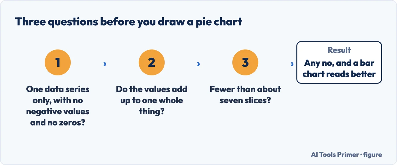
Three questions, and any no sends you to a bar chart. Figure drawn by AI Tools Primer.
The interesting part is the sentence before that one. Microsoft does not simply document the pie chart; it publishes conditions for using it at all, and states what to do when your data fails them.
Microsoft’s three conditions, and the reason for the third
Quoted from the Excel documentation. “Pie charts work best when:”
“You have only one data series.”
Two years of figures side by side is two series. A pie cannot hold them, which is why the chart looks wrong before you have done anything else.
“None of the data values are zero or less than zero.”
A pie has no way to draw a negative. There is no slice smaller than nothing.
“You have no more than seven categories, because more than seven slices can make a chart hard to read.”
Microsoft gives the reason as well as the limit. It is about the reader, not about Excel.
And the tip Microsoft puts directly underneath, which is the most useful sentence on the page:
“If your data won’t work in a pie chart, try a bar chart, column chart, or line chart.”
The third condition is the one that gets broken most, and its full wording matters: no more than seven categories, all of which represent parts of the whole pie. That second half is a stricter test than the count. If the slices are not components of one total — if they are separate measurements that happen to sit in a column — then the circle is claiming a relationship that does not exist, and it would be claiming it just as loudly with three slices as with twenty.
“For example, in the pie chart below, without the data labels it would be difficult to tell
that coffee was 38% of total sales.”
That is Microsoft’s own documentation, read 22 August 2026, and it is worth sitting with. The
company that ships the chart is telling you that you cannot read a value off it unless the number is
printed on top. Which is the honest description of a pie: it shows that one thing is bigger than
another, and almost nothing beyond that. Add the labels — select the chart, then Add Chart
Element › Data Labels — and Microsoft notes they “are linked to values on the worksheet, and
they update automatically when changes are made”.
too many small slices
Pie of pie, or bar of pie
Microsoft: these “show smaller values pulled out into a secondary pie or stacked bar chart, which
makes them easier to distinguish”. The long tail moves into a second chart at readable size instead
of becoming six slivers. Chart Design › Change Chart Type, then pick it from the gallery.
more than one data series
The doughnut
Microsoft describes it as showing “the relationship of parts to a whole” like a pie, “but it can
contain more than one data series”. It is the documented answer to the first condition — though
each extra ring is harder to read than the one inside it, so two is a practical limit.
One thing a pie can never do, and it shows up in reports. Two pies side by side are not comparable. Each one is scaled to its own total, so a slice that grew from a quarter to a third might represent less than it did before, if the total shrank. If the question is “how did this change?”, the shape you want is a column chart with the two periods next to each other — and Microsoft’s own tip says as much.
Pie chart or pie graph, create or make — all the same thing. How to create a pie chart in excel and how to make a pie graph in excel reach the same Insert menu, and the three conditions above apply to every one of those phrasings.
Emphasis, if you need it. Microsoft: “You can draw attention to individual slices of the pie chart by dragging them out.” One slice pulled slightly clear is a legitimate way to point at something. Every slice pulled out is a decorative explosion that makes the sizes harder to compare, which was the only thing the chart was doing for you.
And the 3-D pie. Excel offers it and it is the worst offender in the whole chart gallery, because tilting a circle foreshortens it: the slices at the front are drawn larger than equal slices at the back. A pie chart is already a weak instrument for reading quantities, as Microsoft’s own sentence about the labels admits. The flat version is the one that at least does not add error of its own.
Google’s catalogue makes the same distinction, one shelf lower. Its list of chart types names each one by the question it answers — a line chart “to look at trends or data over a time period”, an area chart “to track one or more data series graphically” — which is the test this page applies to the pie. A pie answers exactly one question, about parts of a single whole. When your data does not pose that question, the honest move is not a better pie: it is a bar chart, in whichever program you are in.
Every quoted condition, tip and description above is from Microsoft’s own Excel documentation, read on 22 August 2026 and listed below. The point about two pies not being comparable, and the reading of the “parts of the whole” clause, are ours.
Not covered here. It will not present the pie as a neutral default. Microsoft publishes three conditions for using one and a tip for when your data fails them, and both are quoted here.
It will not pretend a pie is readable without labels. Microsoft’s own documentation says the opposite, in its own example.
And it will not recommend a charting add-in for something that is one entry on the Insert tab. What holds instead is simple: the conditions for a pie and the note on data labels are Microsoft’s own wording, read on the dates this page names.
Step 12 of 21 in half an hour in a spreadsheet
The order the work actually happens in: the data arrives, it gets cleaned, it gets counted, it gets a chart, and then somebody else opens it.
Microsoft Support — Add a pie chart, including the three conditions for using one, the reason for the seven-category limit, the tip to try another chart type, and the pie of pie and bar of pie variants — support.microsoft.com, read 6 September 2026.
Microsoft Support — Add or remove data labels in a chart, including the example about reading 38% off a pie chart and the note that labels update with the worksheet — support.microsoft.com, read 22 August 2026.
Microsoft Support — Available chart types in Office, including the four conditions for a pie chart and the description of doughnut charts holding more than one data series — support.microsoft.com, read 6 September 2026.
Google Docs Editors Help — Types of charts & graphs in Google Sheets: each chart type named by the question it answers, read as an independent statement of the same rule — support.google.com, read 4 September 2026.
AG
Written by Alberto Gulotta
Founder and editor of AI Tools Primer, writing from Palermo, Italy. Thirty-five years of
taking computers apart, starting with a Commodore 64 — the long version is on the
about page.
Written on 22 August 2026 · last checked 23 September 2026.
§
Independence and limits
No affiliate links and no paid placements anywhere on this site. Nobody pays to appear here,
and no company has seen this page before you did.
This is general information, not professional advice. Where a page touches money, health,
safety or the law, it names its source and the date it was read — and your situation may
still differ. See the privacy page and the
cookie policy.