
Docs · guide
How to make a bar graph in Excel, and which kind
By Alberto Gulotta · Updated · 12 min read
How to make a bar graph in Excel: select the data, Insert › Recommended Charts, pick the bar chart, OK. The menu then asks a second question without saying so, because three different bar charts sit side by side in it and they do not mean the same thing.
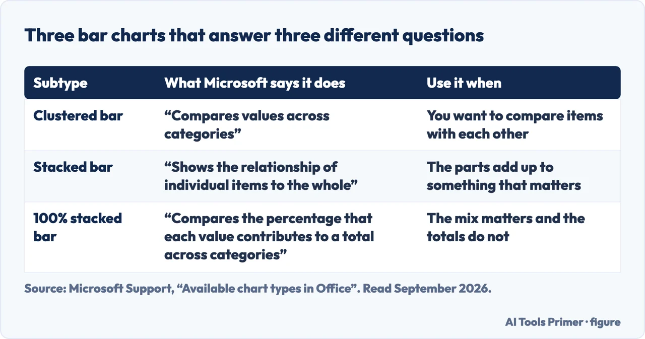
| Subtype | What Microsoft says it does | The question it answers | Source |
|---|---|---|---|
| Clustered bar | “Compares values across categories” | Which item is bigger than which | Microsoft |
| Stacked bar | “Shows the relationship of individual items to the whole” | How big the total is, and roughly what it is made of | Microsoft |
| 100% stacked bar | “Compares the percentage that each value contributes to a total across categories” | How the mix changes when the totals are irrelevant | Microsoft |
| Bar rather than column | Consider a bar chart when “the axis labels are long” or “the values that are shown are durations” | Whether the labels fit at all | Microsoft |
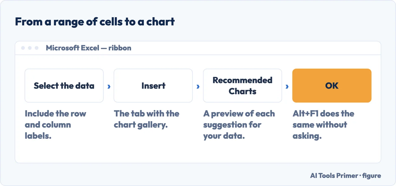
- Select the data for the chart. Include the row and column labels: they become the category names and the legend, and adding them afterwards is more work than selecting them now.
- Select Insert, then Recommended Charts. Microsoft’s own route. The shortcut Alt + F1 makes a chart immediately, with the warning that “it might not be the best chart for the data”.
- Pick the chart on the Recommended Charts tab to preview it. If none of the suggestions is right, “select the All Charts tab to see all chart types” — that is where the three bar subtypes sit side by side.
- Select the chart, then OK. The chart lands on the sheet, linked to the cells: change a number and the bar moves.
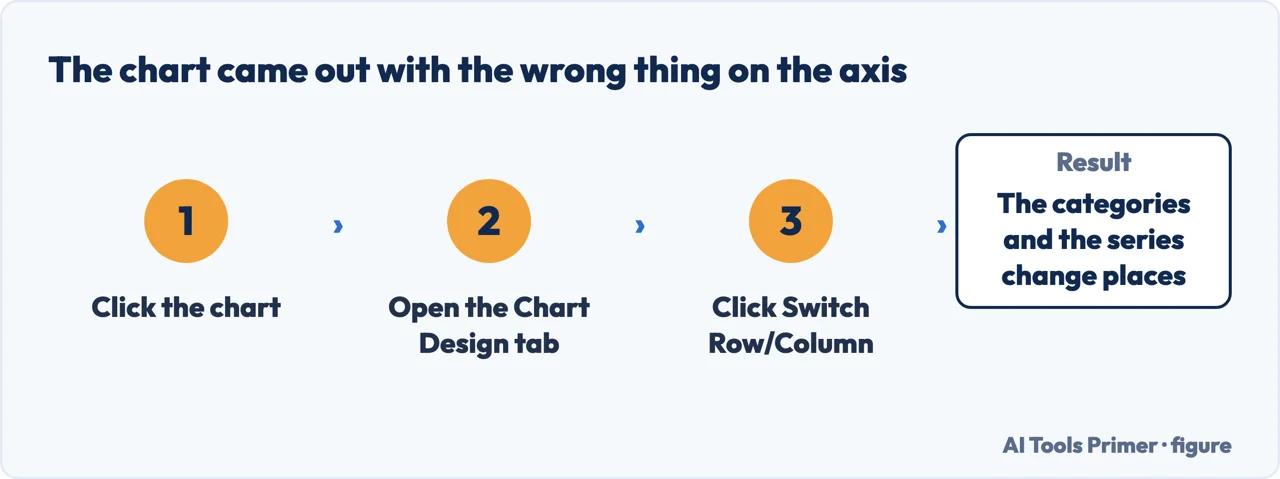
- If the wrong thing is on the axis, use Switch Row/Column. Click the chart, open the Chart Design tab, and click it. Microsoft notes it “is available only when the chart’s Excel data table is open and only for certain chart types”.
Three kinds of bar chart, three different questions
They sit next to each other in the same menu and look like variations on a theme. They are not. Each answers a question the others cannot, and Microsoft states which.
The stacked one is where charts go wrong quietly. It looks like it shows everything at once, and it does show the totals honestly. But ask yourself the question people actually put to a stacked chart — “did the middle segment grow?” — and you will find you cannot answer it, because that segment floats at a different height in every bar. Only the bottom band is measurable. If the comparison you care about is between components rather than totals, a clustered chart answers it and a stacked one does not.
If the bars come out in the opposite order to your rows
This is the single most common complaint about bar charts specifically, and it is not a fault — it is the axis direction. The fix is a checkbox, and Microsoft documents where it lives.
Select the category axis, then Format tab › Current Selection › Format Selection. In the
Axis Options category: “For categories, select the Categories in reverse order check
box.” There is a matching Values in reverse order for the other axis.
One limit worth knowing before you go looking for it elsewhere: Microsoft notes that “you can’t reverse the plotting order of values in a radar chart”.
A bar chart is not always the honest shape. North Carolina State University’s graphing guide for laboratory reports keeps the two apart by what the data is rather than by how it looks: bar graphs compare separate items, while “histograms are a specialized type of bar graph used to summarize groups of data”. Excel offers both in the same gallery and will draw either over the same numbers without comment.
Bar or column? Microsoft settles it in two lines rather than leaving it to taste: “Consider using a bar chart when: The axis labels are long. The values that are shown are durations.” Horizontal bars give long category names room to sit as readable text instead of being squashed or turned on their side, and a duration reads naturally as a length. For everything else, the column chart is the one Microsoft describes as useful “to show how data changes over time or to show comparisons among items”.
Do not start the value axis anywhere but zero. This is the one genuine ethics question in a bar chart, and it is specific to bars: the length of the bar is the value. Cut the axis at 90 and a rise from 92 to 96 becomes a bar twice the height of its neighbour. The same trim on a line chart is a legitimate way to show detail, because a line encodes position rather than length. On bars it is a misrepresentation, and it is the most common one in circulation.
Bar chart or bar graph, create or make — the wording changes and the feature does not. How to create a bar chart in excel and how to make a bar graph in excel are the same Insert menu and the same three kinds of bar. Microsoft calls them charts; the question says graphs; Excel does not mind either way.
The 3-D versions add nothing. Microsoft says so itself: of the 3-D bar variants, a “3-D clustered bar chart shows bars in 3-D format; it doesn’t use a depth axis”. There is no third measurement in that depth — it is a drawing effect on two-dimensional data, and it makes the bars at the front look longer than equal bars behind them.
The steps here, the definitions of the three bar types, the bar-or-column rule and the reverse-order checkbox are all quoted from Microsoft’s own documentation, read on 22 August 2026 and listed below. The warning about stacked charts and the point about the zero baseline are ours.
Where to start
Four ways in.
- “I just need the steps.”
- Above. Then check which kind in which kind of bar
- “Clustered or stacked?”
- That is which kind of bar
- “My bars are upside down.”
- One checkbox — fixing the axis
- “Should this even be a bar chart?”
- Go to the wider choice
Which kind of bar
Clustered, stacked and 100% stacked are three answers to three questions. Picking the wrong one produces a chart that is accurate and unreadable.
Fixing the axis
Most bar chart complaints are axis settings rather than chart faults, and each has a documented checkbox.
The wider choice
A bar chart is one of several shapes, and Microsoft states conditions for each. Sometimes the honest answer is a different chart entirely.
Getting it out
The chart usually has to leave the spreadsheet, and that journey is where quality is normally lost.
Questions people also ask
How do I make a bar graph in Excel with multiple sets of data?
Select all of the columns, labels included, then Insert › Recommended Charts. Several series give you a clustered bar by default — the subtype Microsoft describes as “compares values across categories”. If the series and the categories come out the wrong way round, click the chart and use Switch Row/Column on the Chart Design tab.
Should I use a bar chart or a column chart?
Microsoft gives two tests rather than leaving it to taste: consider a bar chart when “the axis labels are long” and when “the values that are shown are durations”. Long category names fit along a horizontal bar and get cut off or turned sideways under a column.
What is the difference between stacked and 100% stacked?
A stacked bar “shows the relationship of individual items to the whole”, so the bar length is the total. A 100% stacked bar “compares the percentage that each value contributes to a total across categories”, so every bar is the same length and only the mix varies. The first keeps the totals; the second throws them away on purpose.
Why can I not tell whether a middle segment grew?
Because in a stacked chart only the bottom band starts from the same line in every bar. Every segment above it floats at a different height, so the eye has no baseline to compare against. If the comparison you care about is between components, a clustered chart answers it.
Not covered here. It will not treat clustered, stacked and 100% stacked as styling. They answer three different questions, and Microsoft says which is which.
It will not let a truncated axis pass. On a bar chart the length is the value, and cutting the baseline misrepresents it.
And it will not recommend a charting add-in for something that is one dropdown on the Insert tab. What holds instead is simple: the chart definitions and the bar-or-column rule are Microsoft’s own wording, read on the date this page names.
Step 10 of 21 in half an hour in a spreadsheet
The order the work actually happens in: the data arrives, it gets cleaned, it gets counted, it gets a chart, and then somebody else opens it.
- Before this
- How to make a graph in Excel, and which one to pick
- After this
- How to make a line graph in Excel, and when not to
The same chart, in Excel and in Google Sheets
The chart is the same decision in both programs; only the menus differ. Which one you are in decides which guide to open.
- The same job, in the other places it comes up
- How to make a graph in Google Sheets, and keep it live
- How to make a bar graph in Google Sheets, and lay out the data
- How to make a line graph in Google Sheets, and fix the scale
- How to make a pie chart in Excel that people can read
Sources
- Microsoft Support — Available chart types in Office, including the definitions of clustered, stacked and 100% stacked bars, when to use a bar rather than a column, and the note that 3-D bar charts use no depth axis — support.microsoft.com, read 6 September 2026.
- Microsoft Support — Change the plotting order of categories, values, or data series, including the Categories in reverse order check box and the radar chart exception — support.microsoft.com, read 22 August 2026.
- Microsoft Support — Create a chart from start to finish, for the Insert and Recommended Charts route — support.microsoft.com, read 6 September 2026.
- LabWrite, North Carolina State University — Graphing with Excel: bar graphs and histograms, and the rule that a histogram is a bar graph for summarising groups of data — www.ncsu.edu, read 3 September 2026.
Written by Alberto Gulotta
Founder and editor of AI Tools Primer, writing from Palermo, Italy. Thirty-five years of taking computers apart, starting with a Commodore 64 — the long version is on the about page.
Something wrong on this page? Write to aitoolsprimer@gmail.com and it gets fixed.
Written on 22 August 2026 · last checked 23 September 2026.
Independence and limits
No affiliate links and no paid placements anywhere on this site. Nobody pays to appear here, and no company has seen this page before you did.
This is general information, not professional advice. Where a page touches money, health, safety or the law, it names its source and the date it was read — and your situation may still differ. See the privacy page and the cookie policy.