
Docs · guide
How to make a graph in Google Sheets, and keep it live
By Alberto Gulotta · Updated · 11 min read
To create a graph in Google Sheets: select the cells, then Insert › Chart. What that leaves out is the part that makes Sheets worth using at all — the chart need not be a picture. It can stay attached to the numbers, inside a document somebody else is reading.
| What you want | Where it is | What Google says | Source |
|---|---|---|---|
| Make the chart | Select the cells, then Insert › Chart | Sheets picks a type for you; it is a guess | |
| Change the type | Double-click the chart › Setup › Chart type | “Click the Down arrow”, then “choose a chart from the list” | |
| Change what is plotted | Setup › Data range › Grid | “To add more data to the chart, click Add another range” | |
| Add gridlines | Customize › Gridlines | Only on “line, area, column, bar, scatter, waterfall, histogram, radar, or candlestick charts” | |
| Change one bar or point | Right-click it › Format Data Point | “You can add borders to bars and columns, but not to points or lines” |
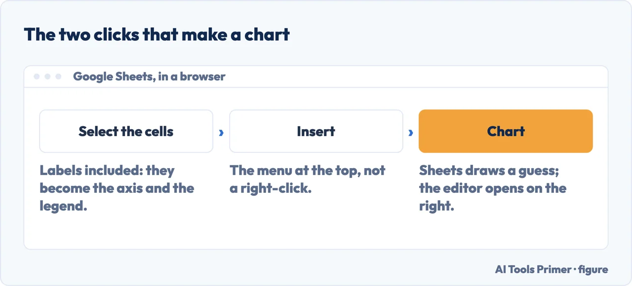
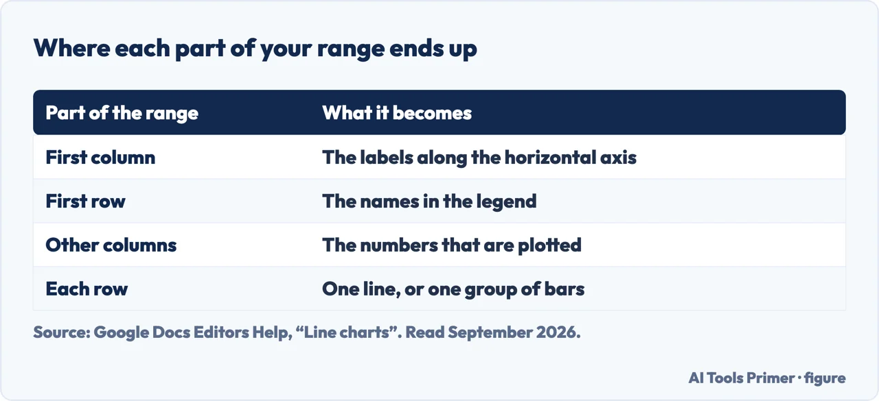
- Lay the data out before you draw anything. Google’s rule for a chart’s range is that the first column becomes the labels on the horizontal axis, the first row becomes the legend, and each row is one series. Get this wrong and no setting later will fix it.
- Select the cells you want in the chart, labels included. The labels are not decoration: they are where the axis names and the legend come from.
- Click Insert, then Chart. Sheets draws something at once. Treat it as a proposal.
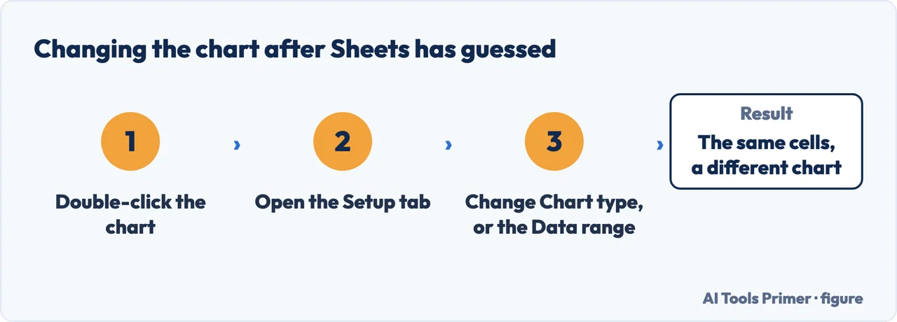
- Double-click the chart and open Setup. Under Chart type, click the down arrow and pick the one you actually meant.
- Add the rest of the data from the same tab. Under Data range, use Grid to reselect, and “Add another range” for columns that are not next to each other.
Insert › Chart, then everything happens in one panel
Select the cells first, then Insert › Chart. The Chart editor opens on the right and has two tabs, which is the whole interface.
- Chart type — the dropdown that changes what it is. Google’s route: double-click the chart, Setup, then the down arrow under “Chart type”.
- Data range — “the set of cells you want to include in your chart”. Click the grid icon to redraw it.
- Add another range — a second, non-adjacent block of cells in the same chart.
- Colours, lines, shapes, opacity and fonts.
- Gridlines, with a limit Google states: they can go on “line, area, column, bar, scatter, waterfall, histogram, radar, or candlestick charts”. Not on a pie.
Add another range is the one worth remembering. It is the answer to the most common shape problem in a spreadsheet — the labels are in column A and the figures you want are in column F, with four columns in between that have nothing to do with the chart.
That covers making one. Now the part that is specific to Google, and the reason a chart built here behaves differently from one built anywhere else.
What the link actually does, in Google’s words
- Putting it there
- Insert › Chart › From Sheets, pick the spreadsheet, pick the chart. “If you don’t want the chart linked to the spreadsheet, uncheck ‘Link to spreadsheet.’”
- Which way it flows
- One way only. “If you make edits to the linked chart, table, or slide in your new file, the changes won’t be copied to the original file.”
- Who wins
- The spreadsheet. “When linked objects are updated, any edits to the objects in the original file will override changes made in the new file.”
- Starting from the document
- Insert › Chart inside Docs or Slides makes a chart that “will link to a new Google Sheet” — a spreadsheet you did not ask for, holding your figures.
- Tables, not charts
- A separate limit: “Tables with more than 400 cells will paste unlinked into your document.”
Graph or chart. Google calls it a chart throughout its own documentation and in the menus, which is worth knowing before you go looking: the Insert menu has no entry called graph. It is the same feature under the other word.
And the choice of shape is not a matter of taste. North Carolina State University’s graphing guide separates them by what the data is rather than by how it looks: a bar graph compares separate items, while “histograms are a specialized type of bar graph used to summarize groups of data”. Sheets will draw either over the same numbers and say nothing.
The practical value is that a monthly report stops being a monthly rebuild. The deck holds a linked chart, the spreadsheet gets this month’s figures, and the chart offers to update. Nobody exports a picture, nobody pastes it in the wrong place, and nobody presents last month’s numbers because they forgot the last step. That is a real saving, and it is why the link is on by default.
“People with access to your document or presentation will be able to view all linked charts, tables, or slides, even if they don’t have access to the file containing the original charts, tables, or slides.”
Google’s own warning, read 22 August 2026, and it appears on none of the tutorial pages that answer this question. The chart carries its picture out past the spreadsheet’s permissions. Link a chart from a restricted sheet — salaries, a pipeline, patient counts — into a deck shared with the whole company, and everyone who opens the deck sees the chart. The spreadsheet stays locked. The numbers in it, in the shape you charted them, do not.
So the link is a sharing decision, not just a convenience. Before you insert a chart from a restricted spreadsheet, the question to ask is who will open the document — and if the answer is “more people than can open the sheet”, then unchecking Link to spreadsheet gives you a static picture, which is exactly what you want in that case. The chart still shows what it showed. It just stops being a window.
One more thing to check before you present it. Because updates flow one way, a chart you restyled inside the presentation will lose that styling when the spreadsheet pushes an update — Google is explicit that edits in the original “will override changes made in the new file”. If a chart needs to look a particular way for a deck, style it in the spreadsheet, where the styling survives.
Every quoted line above is from Google’s own Docs Editors documentation, read on 22 August 2026 and listed below. The reading of the permissions warning, and the advice to style in the spreadsheet rather than the deck, are ours.
Where to start
Four ways in.
- “I just need a chart.”
- Two clicks, above — the chart editor
- “My data is in two separate columns.”
- Add another range — the chart editor
- “I need it in a slide deck.”
- Link it, and read the warning — linking it elsewhere
- “Which chart should this be?”
- That question is settled in choosing the chart
The chart editor
Two tabs, Setup and Customize, and almost everything people search for separately lives in one of them.
Linking it elsewhere
The capability that distinguishes a Sheets chart, and the permissions consequence Google states and nobody repeats.
Choosing the chart
Which shape fits the data is the same question in every spreadsheet, and Microsoft happens to publish the clearest rules for it.
The numbers underneath
A chart is a picture of a range, and most chart problems are range problems wearing a disguise.
Questions people also ask
How do I create a graph in Google Sheets?
Select the cells you want, labels included, then click Insert › Chart. Sheets draws a chart straight away and opens the editor on the right; if it guessed the wrong type, double-click the chart, open Setup and change Chart type.
Why is my chart plotting the wrong thing?
Almost always the range. Google’s layout rule is that the first column becomes the horizontal axis labels, the first row becomes the legend, and each row is a series. If the numbers and the labels are the other way round, the chart is reading your sheet exactly as instructed.
How do I add data from columns that are not next to each other?
Double-click the chart, open Setup, and under Data range use Grid to reselect. Google’s own wording for the rest: “To add more data to the chart, click Add another range. Then, select the cells you want to add.”
Does Google call it a graph or a chart?
A chart, everywhere in its own documentation and in the menus. There is no entry called graph on the Insert menu, which is worth knowing before you go looking for one.
Not covered here. It will not stop at Insert › Chart. The two clicks are on Google’s own page; what happens after the chart leaves the spreadsheet is what this guide is for.
It will not describe linking as purely a convenience. Google warns that a linked chart is visible to people who cannot open the spreadsheet, and that warning is quoted here in full.
And it will not recommend a charting add-on for something that is one item on the Insert menu. What holds instead is simple: the editor tabs and the warning about a linked chart are Google’s own wording, read on the date this page names.
The same chart, in Excel and in Google Sheets
The chart is the same decision in both programs; only the menus differ. Which one you are in decides which guide to open.
- The same job, in the other places it comes up
- How to make a graph in Excel, and which one to pick
- How to make a bar graph in Excel, and which kind
- How to make a bar graph in Google Sheets, and lay out the data
- How to make a line graph in Excel, and when not to
- How to make a line graph in Google Sheets, and fix the scale
- How to make a pie chart in Excel that people can read
Sources
- Google Docs Editors Help — Add and edit a chart or graph, including the Insert route, the Setup and Customize tabs, the data range, Add another range and which chart types accept gridlines — support.google.com, read 22 August 2026.
- Google Docs Editors Help — Link a chart, table, or slides to Google Docs or Slides, including the warning that linked objects are visible without access to the original file, the one-way flow of edits and the 400-cell table limit — support.google.com, read 3 September 2026.
- LabWrite, North Carolina State University — Graphing: bar graphs and histograms, on choosing the shape by what the data is rather than by how it looks — www.ncsu.edu, read 3 September 2026.
Written by Alberto Gulotta
Founder and editor of AI Tools Primer, writing from Palermo, Italy. Thirty-five years of taking computers apart, starting with a Commodore 64 — the long version is on the about page.
Something wrong on this page? Write to aitoolsprimer@gmail.com and it gets fixed.
Written on 22 August 2026 · last checked 23 September 2026.
Independence and limits
No affiliate links and no paid placements anywhere on this site. Nobody pays to appear here, and no company has seen this page before you did.
This is general information, not professional advice. Where a page touches money, health, safety or the law, it names its source and the date it was read — and your situation may still differ. See the privacy page and the cookie policy.