
Docs · guide
How to make a line graph in Google Sheets, and fix the scale
By Alberto Gulotta · Updated · 13 min read
Select the cells, Insert › Chart, and change the type under Setup if Sheets guessed something else. That is how to make a line graph in google sheets, and it is genuinely all there is to the making. What follows is the two things that go wrong afterwards, both of which Google documents and nobody quotes.
Google is direct about what the chart is for: “Use a line chart when you want to find trends in data over time. For example, get trends in sales or profit margins each month, quarter, or year.” Over time is the operative phrase. A line joins its points, and joining says the thing between them moved continuously from one to the other — which is true of months and false of, say, four departments.
| What you want | Where it is | What Google says | Source |
|---|---|---|---|
| Make the chart | Select the cells, then Insert › Chart | Sheets picks a type; you can change it | |
| Change the type | Double-click the chart › Setup › Chart type | Google’s route: double-click, then Setup, then the Down arrow beside Chart type | |
| Move one line to its own scale | Customize › Series › axis location | “Series: Change line colors, axis location, or add error bars, data labels, or trendline” | |
| Set the range of an axis | Customize › Vertical axis | “Edit or format axis text, set min or max value, or log scale” | |
| Swap what is on the axis | Setup, switch rows and columns | “If the chart doesn’t show the data on the axis you want, learn how to switch rows and columns” |
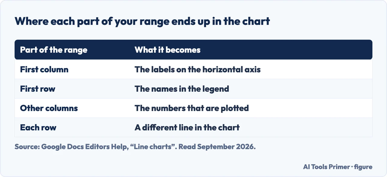
- Lay the data out the way the chart reads it. Google: labels in the first column “show up on the horizontal axis”, the first row becomes “labels in the legend”, and “each row represents a different line in the chart”.
- Select the cells you want to include in your chart. Labels included — they are what the axis and the legend are made of.
- Click Insert, then Chart. Sheets draws something immediately; it is a guess, not a decision.
- Double-click the chart, open Setup, and set Chart type to Line. Google’s steps are to click the Down arrow beside Chart type, then “choose a chart from the list”.
- If a line is flat, go to Customize and give it its own axis. Under Series, pick the series, then change its axis location. That is the setting that rescues two series with very different sizes, and it is one tab away from where the chart was made.
Where each part of your range ends up
Google states this for line charts specifically, and it differs from what the same documentation says about bar charts — which is worth knowing if you switch between the two.
- First column
- “Enter a label to describe the data. Labels from the first column show up on the horizontal axis.” On a bar chart, the same column goes on the vertical axis instead.
- First row
- Optional. “Entries in the first row show up as labels in the legend” — so your column headings name the lines.
- Other columns
- “For each column, enter numeric data.”
One caution about that page. It also says “Each row represents a different line in the chart”, while its own worked example puts five years down the first column and two columns of figures beside them, which gives two lines rather than five. If your chart comes out with the wrong number of lines, do not spend time on the sentence — Google’s own tip is the control that settles it: “If the chart doesn’t show the data on the axis you want, learn how to switch rows and columns.”
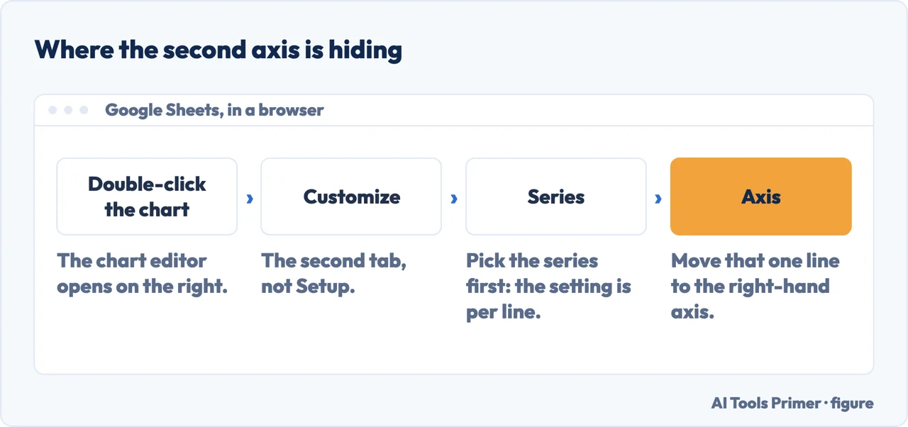
When two lines cannot share an axis
This is the problem that actually stops people, and it has a documented answer that is not a line chart at all. Put revenue and profit margin on the same chart and the margin line lies flat along the bottom, because one series is in the tens of thousands and the other is a number under twenty.
Google’s answer is the combo chart: “Use a combo chart when you want to represent different data series using lines and bars.” Its own example is exactly this case —
| Year | Revenue | Net Income | Profit margin |
|---|---|---|---|
| 2014 | $43,000 | $5,900 | 14% |
| 2015 | $56,400 | $8,800 | 16% |
| 2016 | $67,988 | $10,500 | 15% |
Two currencies as bars, one percentage as a line, each read against its own axis. The control that makes it work sits under Customize › Series, which Google lists as the place to “change line colors, axis location, or add error bars, data labels, or trendline”. Axis location is the setting: it moves a series to the right-hand axis so it gets a scale of its own.
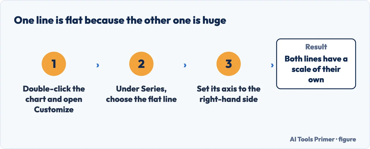
Google has since made this a chart type of its own. The Workspace release notes for combo charts describe exactly this problem and name the answer: the new types include a “Clustered Column - Line on Secondary Axis”, added so that people can visualise “complex dataset visualization with different scales and metrics without requiring manual re-plotting”. If both series are worth seeing and one of them is ten times the other, that is the shape.
And a line is not always the honest shape either. North Carolina State University’s graphing guide separates the two cases in one sentence: a line graph joins the points, and “the line segment that connects two points on the graph expresses a slope”; a scatter plot exists for when “the individual points should not be connected directly together with a line”. If nothing happened between your measurements, the line is claiming something you did not measure.
Once the scales are sorted, the remaining line-chart decision is how many lines. Sheets will draw as many as your range has columns, and a chart with eight lines is unreadable: the legend becomes a colour-matching exercise, and any line that matters is lost among the ones that do not. Three or four is usually the practical limit. If you need eight, what you have is eight small charts sharing an axis, not one chart.
What lives under Customize. Double-click the chart and the second tab holds chart style, titles, series, legend, both axes and gridlines. Two entries are worth knowing before you go looking. Under Vertical axis you can “set min or max value, or log scale” — and unlike a bar chart, a line chart may legitimately start above zero, because a line encodes position rather than length. Cutting the axis to show detail in a narrow range is a reasonable thing to do, provided the axis is labelled so a reader can see you did it.
The log scale in the same menu is not a formatting choice. It changes what equal vertical distances mean — on a logarithmic axis they represent equal multiplication rather than equal addition. That is the right tool for something growing by percentages over a long period, and a thoroughly misleading one for anything else, because a reader who has not noticed the axis will read the slope in the ordinary way.
The description of what a line chart is for, the data layout rules, the combo chart and the Customize options above are quoted from Google’s own Docs Editors documentation, read on 22 August 2026 and listed below. The observation about the mismatch between that page and its example, and the advice on line counts and log scales, are ours.
Where to start
Four ways in.
- “I just need a line chart.”
- First paragraph. Then check where the data goes
- “One of my lines is flat along the bottom.”
- That is a scale problem — two different scales
- “The wrong number of lines appeared.”
- Switch rows and columns — where the data goes
- “Should it be a line at all?”
- Go to choosing the chart
Where the data goes
Google states which part of your range becomes the axis and which becomes the legend, and the two differ between chart types.
Two different scales
The most common reason a line chart is unreadable, and the documented answer is a different chart type rather than a setting.
Choosing the chart
Which shape fits the data is the same question in every spreadsheet, and it is answered most clearly in the Excel documentation.
Getting it out
A Sheets chart can leave as a picture or as a live link, and the two behave very differently once other people can open it.
Questions people also ask
How do I make a line graph in Google Sheets?
Select the cells, including the labels, then click Insert › Chart. If Sheets guesses a different type, double-click the chart, open Setup, and pick Line under Chart type.
How do I make a line graph with two lines?
Give each series its own column. Google’s rule for laying out the data is that “each row represents a different line in the chart” and the first row becomes the legend, so two columns of numbers with names on top give you two named lines.
Why is one of my lines flat?
Because both lines share one scale, and one of them is much bigger. Google’s fix is per series: Customize › Series, choose the small one, and change its axis location so it is read against the right-hand axis. Sheets also offers a “Clustered Column - Line on Secondary Axis” combo chart for the same problem.
Why is the wrong thing on the horizontal axis?
Because the chart is reading your rows as series and your columns as categories, or the other way round. Google’s own tip: “If the chart doesn’t show the data on the axis you want, learn how to switch rows and columns.” It is a switch in Setup, not a reason to rebuild the range.
Not covered here. It will not stop at Insert › Chart. The making takes a sentence; what goes wrong afterwards takes the page.
It will not repeat a line from the documentation that its own example contradicts. The mismatch is pointed out so you can check it yourself.
And it will not treat a log scale as a formatting option. It changes what the picture means. What holds instead is simple: what the chart is for and the combo chart route are Google’s own wording, including the line its own example contradicts.
The same chart, in Excel and in Google Sheets
The chart is the same decision in both programs; only the menus differ. Which one you are in decides which guide to open.
- The same job, in the other places it comes up
- How to make a graph in Excel, and which one to pick
- How to make a graph in Google Sheets, and keep it live
- How to make a bar graph in Excel, and which kind
- How to make a bar graph in Google Sheets, and lay out the data
- How to make a line graph in Excel, and when not to
- How to make a pie chart in Excel that people can read
Sources
- Google Docs Editors Help — Line charts, including what the chart is for, how to format the data, the combo chart for mixed series and the Customize options including axis location and log scale — support.google.com, read 22 August 2026.
- Google Docs Editors Help — Bar charts, for the contrast in how the first column is used between the two chart types — support.google.com, read 22 August 2026.
- Google Docs Editors Help — Add and edit a chart or graph, for the Insert route, the Setup tab and changing the chart type — support.google.com, read 3 September 2026.
- Google Workspace Updates — Import and create combo charts in Google Sheets, which names the “Clustered Column - Line on Secondary Axis” type and the problem it was added for — workspaceupdates.googleblog.com, read 3 September 2026.
- LabWrite, North Carolina State University — Line graphs and scatter plots, on what joining two points claims and when the points should not be joined — www.ncsu.edu, read 3 September 2026.
Written by Alberto Gulotta
Founder and editor of AI Tools Primer, writing from Palermo, Italy. Thirty-five years of taking computers apart, starting with a Commodore 64 — the long version is on the about page.
Something wrong on this page? Write to aitoolsprimer@gmail.com and it gets fixed.
Written on 22 August 2026 · last checked 23 September 2026.
Independence and limits
No affiliate links and no paid placements anywhere on this site. Nobody pays to appear here, and no company has seen this page before you did.
This is general information, not professional advice. Where a page touches money, health, safety or the law, it names its source and the date it was read — and your situation may still differ. See the privacy page and the cookie policy.