How to make a line graph in Excel: select the data, Insert › Recommended Charts, choose the line chart, OK. The question worth a page is whether a line chart is the right shape for what you have — and Microsoft answers that in one sentence, on a different page.
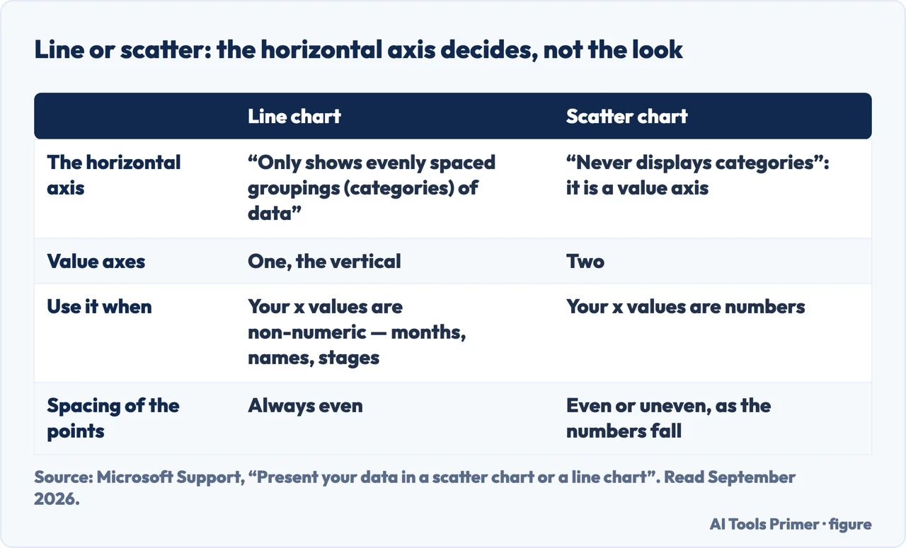
Line or scatter: the horizontal axis decides, and Microsoft says which is which
Line chart
Scatter chart
Source
The horizontal axis
“Only shows evenly spaced groupings (categories) of data”
“Never displays categories on the horizontal axis”
Microsoft
Value axes
One, the vertical
Two
Microsoft
Use it when
“Your data has non-numeric x values”
“For numeric x values, it is usually better to use a scatter chart”
Microsoft
Spacing of the points
Always even
“Evenly or unevenly across the horizontal axis, depending on the data”
Microsoft
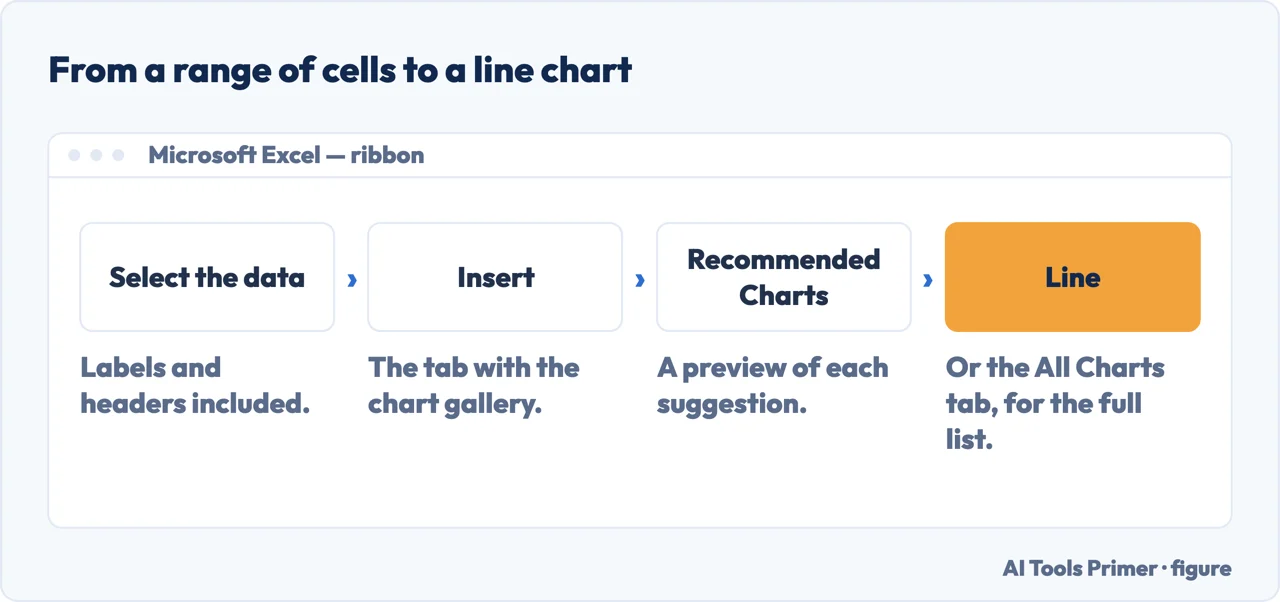
Four steps, and the choice that matters was made before the first one. Figure drawn by AI Tools Primer.
Look at your first column before you draw anything. If it holds months, names or
stages, a line chart is right. If it holds numbers that are measurements, it is not.
Select the data, labels included. The first row becomes the legend and the first column
becomes the horizontal axis.
Insert › Recommended Charts, then pick the line chart and select OK. The shortcut
Alt + F1 makes one at once, with Microsoft’s own caveat that “it might not
be the best chart for the data”.
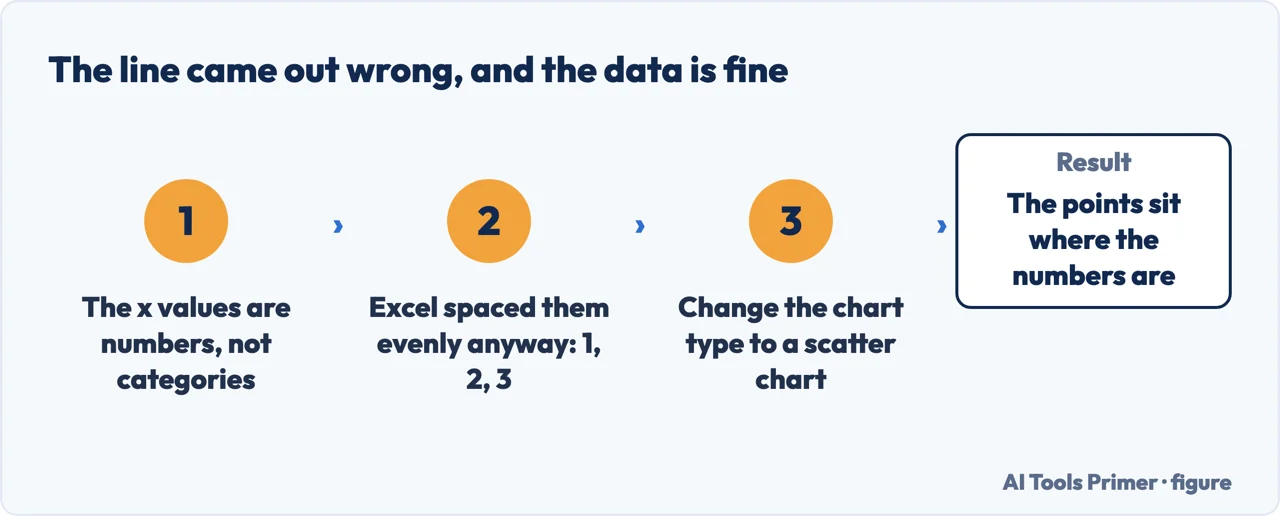
Check where the points landed on the horizontal axis. If your x values were numbers and
the chart has spaced them 1, 2, 3, Excel has thrown the spacing away — the numbers became
categories.
When that happens, change the type to a scatter chart. It is the same data and the same
two columns; only the axis stops pretending your numbers are labels.
“Use a line chart if your data has non-numeric x values — for numeric x values, it is
usually better to use a scatter chart.”
Microsoft, read 22 August 2026. That is the whole decision in one sentence, and it appears on none
of the tutorial pages that rank above it. The line chart is not the general-purpose chart people
treat it as — it has one value axis, and whatever you put along the bottom becomes a category
rather than a position.
One value axis or two: everything else follows from that. Figure drawn by AI Tools Primer.
What a line chart does with the bottom axis
Microsoft: a line chart “only has one value axis (the vertical axis)”, and its horizontal axis
“only shows evenly spaced groupings (categories) of data”.
So your x values are not plotted as quantities. They are labels, laid out at equal spacing in the
order they appear.
What a scatter chart does instead
Microsoft: “A scatter chart always has two value axes”, and it “never displays categories on the
horizontal axis”.
Both numbers are positions. Points land “at the intersection of an x and y numerical value”, and
may be spread “evenly or unevenly … depending on the data”.
The same two columns, drawn by a chart that reads them as numbers. Figure drawn by AI Tools Primer.
And there is a claim in the line itself. North Carolina State University’s graphing guide puts it in terms of what the drawing asserts: “the line segment that connects two points on the graph expresses a slope”, which is why a scatter plot exists for the case where “the individual points should not be connected directly together with a line”. Excel will join them either way and say nothing.
Here is what that means in practice. Suppose you have rainfall in one column and a pollution reading in the other, and you want to see whether one tracks the other. Put that on a line chart and Excel does not use your rainfall figures as positions at all. Microsoft’s own worked example spells out the result: “Because categories were not provided in the data, they were automatically generated, for example, 1, 2, 3, and so on. This is a good example of when not to use a line chart.” The chart looks fine. It is answering a different question from the one you asked.
Dates are the exception, and it is the exception that saves the line chart for most ordinary work. A line chart’s category axis can be a text axis or a date axis, and Microsoft describes the date axis as one that “displays dates in chronological order at specific intervals or base units, such as the number of days, months, or years, even if the dates on the worksheet are not in order or in the same base units”. So irregular dates are placed correctly. It is irregular numbers that get flattened into 1, 2, 3.
Which gives a short test before you draw anything. Are the things along the bottom dates, or names, or numbers? Dates and names are what a line chart is for. Numbers mean you probably want a scatter chart, and Microsoft’s list agrees: use one when you want to “change the scale of the horizontal axis”, use a logarithmic scale, “show patterns in large sets of data”, or “compare large numbers of data points without regard to time”.
What Excel does with the holes in your data
A line chart is the chart where missing readings matter most, and Excel’s handling of
them is a setting rather than a rule. Design tab › Data › Select Data › Hidden and Empty
Cells.
Gaps
The line breaks where the reading is missing. Honest, and usually what you want.
Zero
The missing point is plotted as 0. The line dives to the guide and back — a reading you never took, drawn as a collapse.
Connect data points with line
The gap is bridged with a straight segment. Tidy, and it invents a value between the two real ones.
Two notes from the same page. On a scatter chart showing only markers, “you can display empty cells
as gaps or zero only — you cannot connect the data points with a line”. And there is a separate
checkbox, Show data in hidden rows and columns — the counterpart of bringing hidden columns back into view — — which means that by default, filtering or
hiding rows changes the chart. Filter a table and the chart quietly redraws itself around what
is left.
The wording varies. How to create a line chart in excel, how to make a line graph in excel, line chart against line graph — Microsoft says chart, the question says graph, and it is one feature with one rule about what belongs on the horizontal axis.
Markers, briefly. Excel offers the line with or without dots at each reading, and Microsoft gives the rule rather than leaving it to taste: markers help “especially when you have many data points and the order in which they are presented is important”, but “if there are many categories or the values are approximate, use a line chart without markers”. Dots claim precision. If the numbers are estimates, leaving them off is the more honest drawing.
On stacked lines. Excel offers stacked and 100% stacked variants, described as showing “the trend of the contribution of each value over time”. They are harder to read than they look, for the same reason stacked bars are: only the bottom band sits on a flat baseline, so every line above it is riding on the ones below and its own shape is not what you see.
Every quoted rule and description above is from Microsoft’s own Excel documentation, read on 22 August 2026 and listed below. The three-way test for what sits along the bottom axis, and the reading of what each empty-cell option implies, are ours.
Select the data with its labels, then Insert › Recommended Charts, choose the line chart and select OK. If none of the suggestions is right, the All Charts tab has the full list.
How do I make a line graph with two sets of data?
Give each set its own column and select both, headers included: each column becomes a line and each header becomes a legend entry. If one line comes out flat, the two series are on very different scales and one of them needs a secondary axis.
Why are my x values spaced evenly when they should not be?
Because a line chart has only one value axis. Microsoft: its horizontal axis “only shows evenly spaced groupings (categories) of data”, so numeric x values are treated as labels. The fix is a scatter chart, whose horizontal axis is a value axis.
When should I use a scatter chart instead?
Microsoft gives the rule in one line: “as a general rule, use a line chart if your data has non-numeric x values — for numeric x values, it is usually better to use a scatter chart.”
Not covered here. It will not present the line chart as the default chart. Microsoft gives a one-line rule for when it is the wrong one, and this guide leads with it.
It will not let a missing reading be drawn as a zero without saying so. That is a setting, and the page says where it lives.
And it will not recommend a charting add-in for something that is one entry on the Insert tab. What holds instead is simple: the rule about numeric x values and the empty-cell options are Microsoft’s own wording, quoted with the date each page was read.
Step 11 of 21 in half an hour in a spreadsheet
The order the work actually happens in: the data arrives, it gets cleaned, it gets counted, it gets a chart, and then somebody else opens it.
Microsoft Support — Present your data in a scatter chart or a line chart, including the rule about numeric and non-numeric x values, the difference between the axis types, the text axis and date axis distinction, and the worked example of when not to use a line chart — support.microsoft.com, read 6 September 2026.
Microsoft Support — Display empty cells, null (#N/A) values, and hidden worksheet data in a chart, including the Gaps, Zero and Connect data points options and the hidden rows checkbox — support.microsoft.com, read 3 September 2026.
Microsoft Support — Create a chart from start to finish, for the Insert and Recommended Charts route and the caveat on the Alt+F1 shortcut — support.microsoft.com, read 3 September 2026.
LabWrite, North Carolina State University — Line graphs and scatter plots: what joining two points claims, and when the points should not be joined at all — www.ncsu.edu, read 3 September 2026.
Microsoft Support — Available chart types in Office, including when to use markers and the description of stacked line charts — support.microsoft.com, read 6 September 2026.
AG
Written by Alberto Gulotta
Founder and editor of AI Tools Primer, writing from Palermo, Italy. Thirty-five years of
taking computers apart, starting with a Commodore 64 — the long version is on the
about page.
Written on 22 August 2026 · last checked 23 September 2026.
§
Independence and limits
No affiliate links and no paid placements anywhere on this site. Nobody pays to appear here,
and no company has seen this page before you did.
This is general information, not professional advice. Where a page touches money, health,
safety or the law, it names its source and the date it was read — and your situation may
still differ. See the privacy page and the
cookie policy.