Every page answering how to make a graph in excel gives you the same three clicks, and they are correct. They are also the easy half. The half that decides whether the chart is any good is the one that rarely gets written down at all — and Microsoft has written it down.
“You can select the data you want in the chart and press ALT + F1 to create a chart
immediately, but it might not be the best chart for the data.”
That is Microsoft, in its own documentation, read 22 August 2026 — telling you that the fast way
gives you the wrong chart. The clicking is not the hard part of this task and never was. The
hard part is the choice Excel makes for you if you do not make it yourself, and Microsoft publishes
the rules for that choice in a page almost nobody opens.
The three clicks, since you came for them
Select the data, including the row and column labels — those become the axis names and the legend.
Insert › Recommended Charts. Microsoft’s own route. The Recommended tab previews each suggestion against your actual numbers.
“If you don’t see a chart you like, select the All Charts tab to see all chart types.” Then OK.
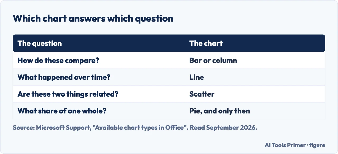
The question first, the chart second. Figure drawn by AI Tools Primer.
Now the part that matters. Below are the three decisions that separate a chart which shows something from one that merely appeared. Every rule quoted is Microsoft’s own, from its documentation of the chart types, and none of them is a matter of taste.
Pie — Microsoft gives four conditions, and most pie charts fail one
Quoted exactly. “Consider using a pie chart when:”
“You have only one data series.”
“None of the values in your data are negative.”
“Almost none of the values in your data are zero values.”
“You have no more than seven categories, all of which represent parts of the whole pie.”
The fourth is the one that matters, and the last six words of it are the
real test. If the slices do not add up to a meaningful whole, it should not be a pie — and
two years of sales side by side is two data series, which fails the first condition outright.
Bar or column — Microsoft answers it in two lines
Columns stand up, bars lie down, and every article treats the choice as taste. Microsoft does not.
“Consider using a bar chart when: The axis labels are long. The values that are shown are
durations.”
That is the whole rule. Long category names — department titles, survey answers,
country names — fit along a horizontal bar and get truncated or turned sideways under a column. And
a duration reads naturally as length. Otherwise use a column chart, which Microsoft describes as
useful “to show how data changes over time or to show comparisons among items”.
Line or scatter — the one that produces a misleading chart, not just an ugly one
Microsoft gives this one as a single sentence: “Use a line chart if your data has non-numeric
x values — for numeric x values, it is usually better to use a scatter chart.” It is the
clearest rule on the whole subject and it appears on none of the tutorial pages above.
The reason is what each axis is. “A scatter chart always has two value axes”, and it
“never displays categories on the horizontal axis”. A line chart “only has one value axis (the
vertical axis)”, and its horizontal axis “only shows evenly spaced groupings (categories) of
data”.
So plot rainfall against particulates on a line chart and Excel does not use your rainfall
numbers as positions at all. Microsoft’s own worked example says what happens: “Because
categories were not provided in the data, they were automatically generated, for example, 1, 2, 3,
and so on. This is a good example of when not to use a line chart.”
Dates are the exception worth knowing, because it rescues the line chart for most
ordinary work. A category axis can be a text axis or a date axis, and Microsoft says a date axis
“displays dates in chronological order at specific intervals or base units … even if the dates
on the worksheet are not in order or in the same base units”. So irregular dates are handled
correctly. Irregular numbers are not.
Notice what those three have in common. None is about how the chart looks. Each is about whether the shape you chose can carry the data you have — one series or several, labels short or long, intervals even or not. Get that right and a plain chart with default colours communicates properly. Get it wrong and no amount of formatting rescues it, because the problem is in the geometry rather than the palette.
A word on 3-D, since Excel offers it everywhere. Microsoft notes of the 3-D variants that a “3-D perspective is not a true 3-D chart because a third value axis (depth axis) is not used”. There is no extra information in the depth — it is decoration applied to two dimensions of data, and it makes columns at the front look larger than equal columns behind them. If the chart is going into something somebody has to read numbers from, the flat version is the honest one.
If you are plotting a trend, Excel will draw the trend line for you rather than making you estimate it: Chart Design › Add Chart Element › Trendline, where Microsoft lists Linear, Exponential, Linear Forecast and Moving Average. Worth knowing that the forecast option extends the line past your last data point, which is a claim about the future rather than a description of the past — fine when you mean it, misleading when it arrives by accident.
The wording varies and the job does not. How to create charts in excel, how to create a chart in excel, how to make a graph in excel — same menu, same three clicks. So do the specific ones: how to make a bar graph in excel, how to create a bar chart in excel, how to make a line graph in excel, how to create a pie chart in excel. All of them are the same route with a different choice at step three, which is why this guide spends its length on that choice rather than on the route.
The same three clicks in the other spreadsheet. Google Sheets puts it under Insert and Chart, and changes the type from a Setup panel on the right rather than from the ribbon. That matters mostly when a file crosses between the two: the chart survives, the panel you edit it from does not. If you build charts in both, the habit that transfers is the one on this page — decide what the chart is answering before choosing its shape, because that decision is the same in every program.
Every quoted rule and description above is from Microsoft’s own Excel documentation, read on 22 August 2026 and listed below. The argument that the choice matters more than the formatting, and the point about the forecast line, are ours.
Microsoft publishes conditions for each type. They are short, they are specific, and following them settles most arguments about a chart before it starts.
Not covered here. It will not stop at the three clicks. Microsoft says itself that the quick chart “might not be the best chart for the data”, and this guide spends its length on that sentence.
It will not call the pie-or-bar decision a matter of taste. Microsoft publishes conditions for both, and they are quoted here in full.
And it will not recommend a charting add-in for something Excel does on the Insert tab. What holds instead is simple: the conditions for each chart type are Microsoft’s own, including its line about the quick chart, and the 3-D note is Microsoft’s too.
Step 9 of 21 in half an hour in a spreadsheet
The order the work actually happens in: the data arrives, it gets cleaned, it gets counted, it gets a chart, and then somebody else opens it.
Microsoft Support — Create a chart from start to finish, including the Recommended Charts route, the All Charts tab, the trendline types and the note that a chart made with ALT+F1 might not be the best chart for the data — support.microsoft.com, read 6 September 2026.
Microsoft Support — Available chart types in Office, including the four conditions for a pie chart, when to use a bar rather than a column, the even spacing of line chart categories, the conditions for a scatter chart and the note on 3-D perspective — support.microsoft.com, read 6 September 2026.
Microsoft Support — Present your data in a scatter chart or a line chart, including the rule about numeric and non-numeric x values, the difference between the two axis types, and the distinction between a text axis and a date axis — support.microsoft.com, read 6 September 2026.
Google Docs Editors Help — Add & edit a chart or graph: the Insert › Chart route and the Setup panel that changes the type, read as the same job in the other spreadsheet — support.google.com, read 4 September 2026.
AG
Written by Alberto Gulotta
Founder and editor of AI Tools Primer, writing from Palermo, Italy. Thirty-five years of
taking computers apart, starting with a Commodore 64 — the long version is on the
about page.
Written on 22 August 2026 · last checked 23 September 2026.
§
Independence and limits
No affiliate links and no paid placements anywhere on this site. Nobody pays to appear here,
and no company has seen this page before you did.
This is general information, not professional advice. Where a page touches money, health,
safety or the law, it names its source and the date it was read — and your situation may
still differ. See the privacy page and the
cookie policy.